Mission of Docs
↑ Back to top- To inform
- To guide and answer
- To educate and empower
How a Style Guide Supports Docs
- Provides consistent presentation and experience for users
- Creates a unified voice for multiple authors
- Saves time and resources by having decisions in place
Voice and Tone
↑ Back to top- Conversational, friendly, and global
Writing Style
↑ Back to top- Clean and lean
Types of Docs
↑ Back to topWe offer two types of documentation — one for all users; one for our developer community with more technical experience.
User
↑ Back to top- Setup and Configuration
- Use Cases
- Comparisons
- Video Tutorials
Developer
↑ Back to top- Hooks and Filters
- Function Reference
- Code Snippets
- API
Writing Docs
↑ Back to topA general overview to crafting product documentation.
Recommended Workflow
↑ Back to topOrganize — Think about your audience, gather notes, and make an outline. Know your outcome.
Draft — Use the templates provided and complete each relevant heading.
- Payment Gateway Docs Template – Examples: Amazon Pay, GoCardless, Payfast, Payment Express, PayPal Advanced.
- Extension/Add-On Docs Template – Examples: WooCommerce Box Office, WooCommerce Memberships, Product Add-Ons, Accommodation Add-On for Bookings.
We also have Use Cases, Tables and Comparisons to assist users in setup or selection of the appropriate product.
Add images — Use Droplr or a similar application to take high-quality screenshots, annotate as needed with arrows and boxes, and meaningfully rename the image. For example, checkout-field-editor-settings.png or subscriptions-woocommerce-shortcodes.png. This is important for SEO and accessibility. Much better than screenshot-2.png. Make sure your screenshots and videos match your written documentation exactly.
Review — Review the Formatting section below, and the Grammar, Punctuation, Style page (add link), and adjust where necessary.
Proofread for typos and incorrect word usage.
Add Clear Steps
↑ Back to topFor user documentation, keep in mind you’re writing for a non-technical audience. Here are a few tips that can help:
- Explain as though the user has zero experience with WooCommerce and your extension.
- List every single step. One missing step in the process can result in a user not being able to follow the instructions.
- Also, use a new step for each separate action.
- Use bold print to highlight:
- The verb — ideally, an imperative — or the main focus of the step
- The path — e.g. WooCommerce > Settings
- Test your documentation by having a new user set up the product. Were they able to work through the documentation without trouble? Were there any confusing or missing pieces of information? Would a screenshot or video be helpful in certain places?
A note on custom code/CSS. Our WooCommerce Support Policy explicitly says that customization is beyond the scope of support we provide. Deciding to include them in your docs is a long-term choice you need to make on your own regarding support, maintenance, troubleshooting and managing customer expectations.
Take Helpful Screenshots
↑ Back to topA good screenshot in the right place can make it easier for users to follow the train of thought.
When adding a screenshot:
- Make sure that you write out the instructions in accompanying text. For visitors who use screen readers, it would be a challenge to follow instructions that are only given via a screenshot.
- Use the default WordPress Admin colors.
- For frontend screenshots, use Storefront as the theme.
- Add the screenshot below the instructions, not above.
- Use light mode if you’re on macOS, not dark mode.
- Use a test site that only has WooCommerce Core and the extension in the doc installed. Other extensions and plugins might add other tabs or sidebar elements.
- Make sure no unnecessary notifications are showing.
- Avoid needing to censor information in the screenshots. Ideally use a vanilla site with sample data. If you need to highlight orders, make sure that you create several different orders by multiple
- If you draw on the screenshot using Droplr, use the dark purple for annotations.
- Use the latest version of WordPress Core, WooCommerce Core, and your extension.
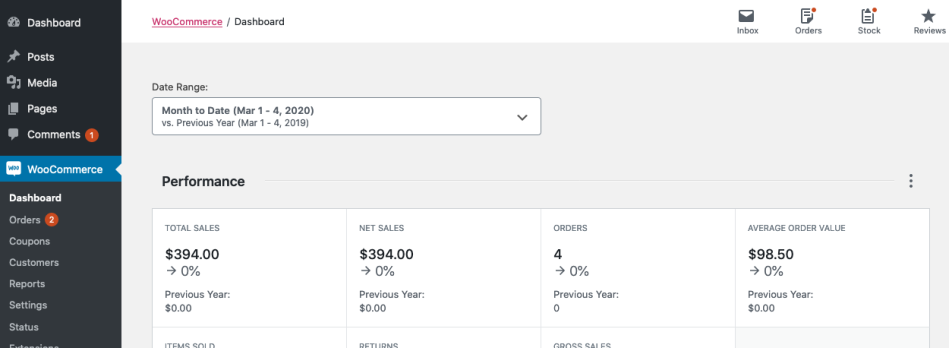
- Take a contextual screenshot for the first screenshot that moves the user to a new path. E.g., when going from a different section to WooCommerce > Settings > Payments, include the sidebar in the screenshot to help the user navigate easily.
Example of a contextual screenshot:
Versus a non-contextual screenshot:
Insert Diversity
↑ Back to topWhen providing examples in documentation, consider using diverse examples. Instead of using products or names that are only popular in the U.S., choose options that are used in different parts of the world.
Use Reusable Blocks
↑ Back to topIf you are using the block editor on our docs site — which we highly recommend — consider using some of the reusable blocks. You can review all available blocks here.
These can be used for:
- Support instructions
- Custom code notifications
- Etc.
One big advantage is that when we update the reusable block due to a change in instructions, they are updated everywhere.
Table of Contents
↑ Back to topThe table of contents are auto generated based off of H2 and H3 blocks. Anchor links are determined based on the content of the heading (eg: #table-of-contents for this section).
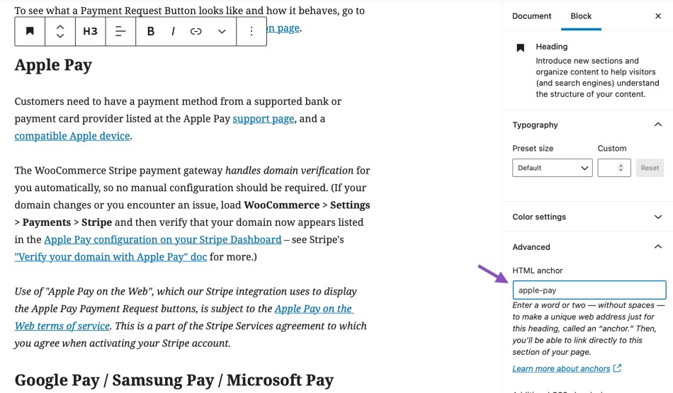
To do so, select the Heading block and go into the Block settings under Advanced. There you’ll find a field to add an HTML anchor. Here are the syntax requirements copied from the WordPress.org Page Jumps document.
- HTML Anchor must be unique within a document.
- HTML Anchor is case-sensitive.
- HTML Anchor can include following symbols: hyphen(-), underscore(_), colon(:), period(.). It cannot include space.
- HTML Anchor must start in the alphabet.
Editing Docs
↑ Back to topOur WooCommerce Docs Lead blind-tests the extension/payment gateway/add-on from installation to going live, verifying accuracy of text and images at every step. Context and/or detail is added, word count is cut to bare minimum, and then the page is previewed, tweaked and finalized.
We’re looking for documentation that is:
- Clear — Straightforward and logical.
- Consistent — Follows content and formatting guidelines.
- Empathetic — Understands and addresses our audience.
- Helpful — Provides information that users need to know to purchase, set up and maximize use of products.
- Pithy — Plainest and fewest number of words with appropriate images.
Banned words
↑ Back to top- awesome, best, fastest, greatest, most — All subjective. Adjectives and marketing copy belong on the product page. Marketing = Why. Documentation = How.
- easy, simple, cakewalk — Disempowers users if they’re unable to follow or understand.
- extremely, really, very — Unnecessary.
Emphasis on words in caps (NOT) or italics (must) is avoided.
Formatting
↑ Back to topAlphabetize lists, so users can quickly scan.
- Categories
- Currency widget
- Related products
- Search bar
Arrows — Use > not -> or >>
Box styles
- Alert — Urgent warning
- Info — Fact or explanation
- Note — Important, non-urgent notice
A bit more details on how to use these can be found below.
Bulleted/Unordered Lists — Use for options and features. Short text lists require no punctuation.
- Apple
- Cherries
- Grapefruit
- Fruit bowls
- Picnic baskets
- Plastic crates and barrels
Longer text lists and complete sentences need a period.
- Overnight service is available Monday-Saturday for $14.95.
- Two-day service is available Monday-Friday for $9.95.
- Three-day service is available Monday-Saturday for $7.95.
Capitalization
- Bulleted lists – First word only
- Headings (h2) – Main words, e.g., Setup and Configuration
- Headings (h3) – First word only
- Product names – WooCommerce Product Add-Ons
FAQs — Questions use h3. Answers follow in normal text.
Headings — Keep brief and relevant. All h2/h3 are auto-assigned anchor links.
- h2 — Appear in TOC in sidebar
- h3 — Appear underneath h2 in sidebar
Numbered/Ordered Lists — Use for how-to steps.
Paragraphs — Keep brief. Walls of text are heavy and intimidating.
Parentheses — Avoid. Practicing clean and lean style means all info is important enough to be in normal sentences.
Punctuation — See Grammar, Punctuation, Style.
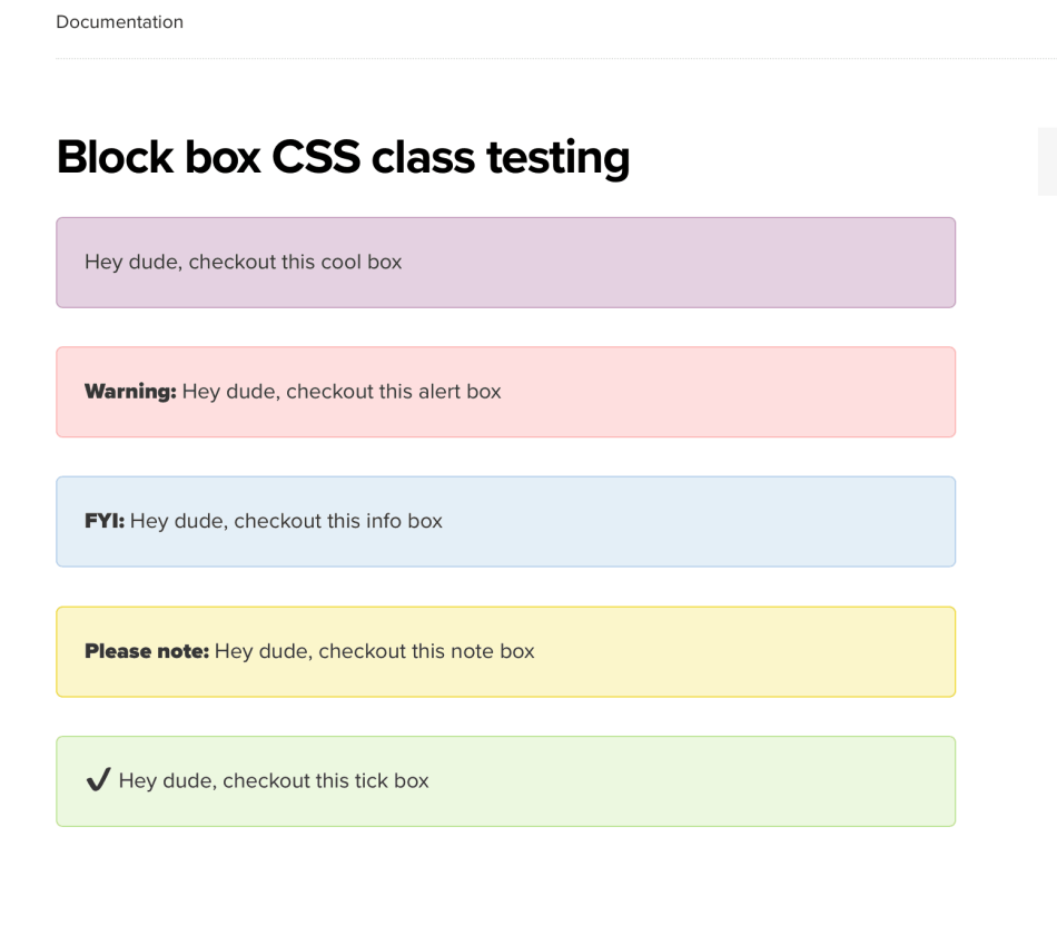
Box Styles
↑ Back to topSince Apr 2020, we’ve made it easier to use box-styles on the docs. Rather than using shortcode, add an Additional CSS class under Block > Advanced:
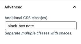
- Always include
block-boxas a class – this will be a purple box by default. - To clarify which type of box you want to use, add one of the following classes:
alert– red background – automatically adds “Warning:” before the blockinfo– blue background – automatically adds “FYI:” before the blocknote– yellow background – automatically adds “Please note:” before the blocktick– green background – automatically adds “✔️” before the block