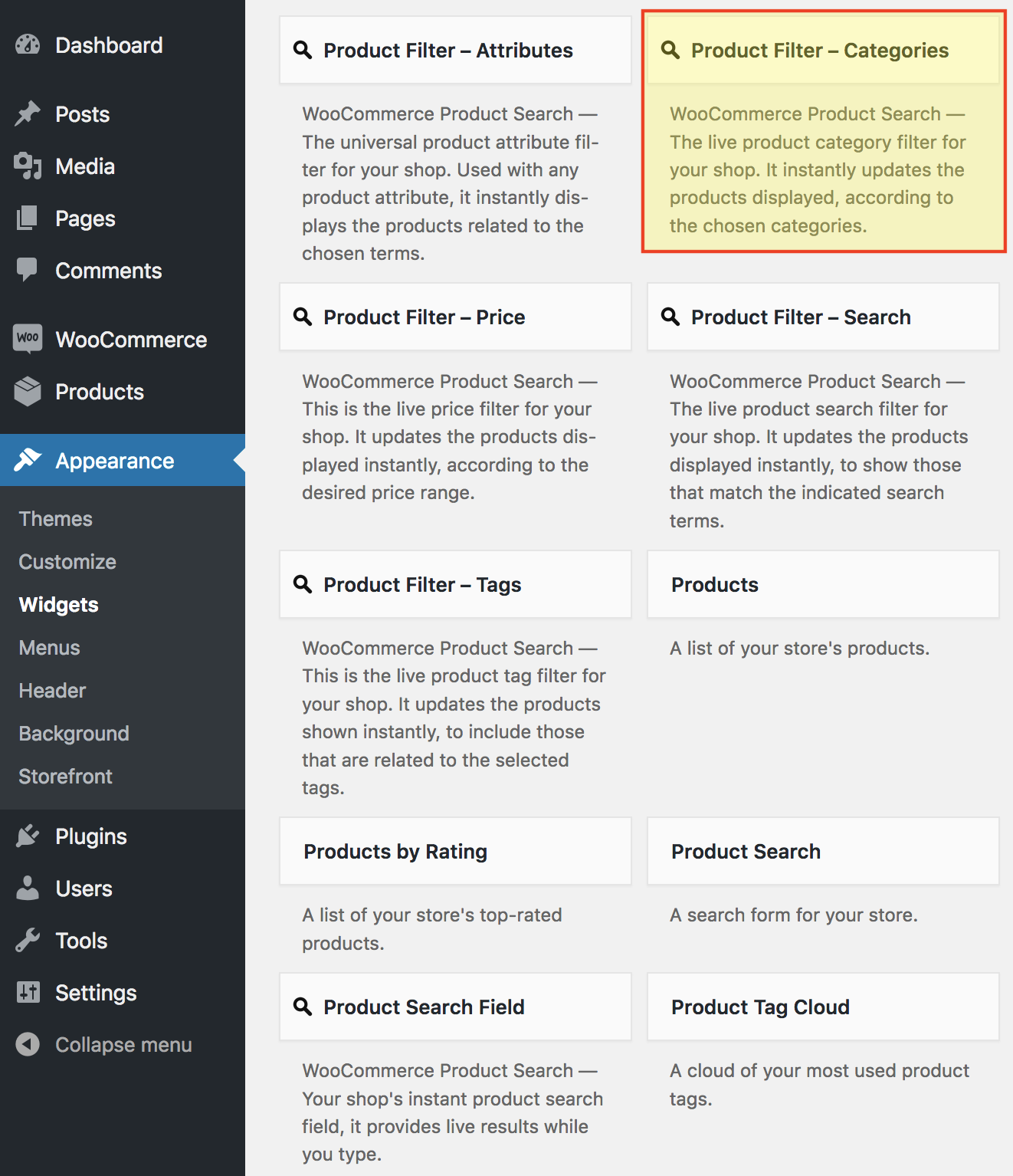
Legacy Widget
↑ Back to topAs of WordPress 5.8, the Block Widgets Editor replaces the previous widgets administration. The widget described here is available as a Legacy Widget when using the new Block Widgets Editor. However, to maintain full widget settings functionality, you must install the Classic Widgets plugin which restores the previous (“classic”) WordPress widgets settings screens.
This page describes a Legacy Widget. With the Block Widgets Editor, we recommend to use the corresponding Product Filter – Categories block instead. See the Blocks page for an overview of all available blocks with the extension.
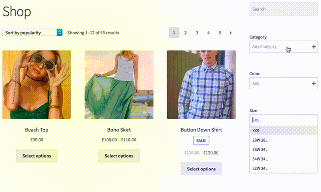
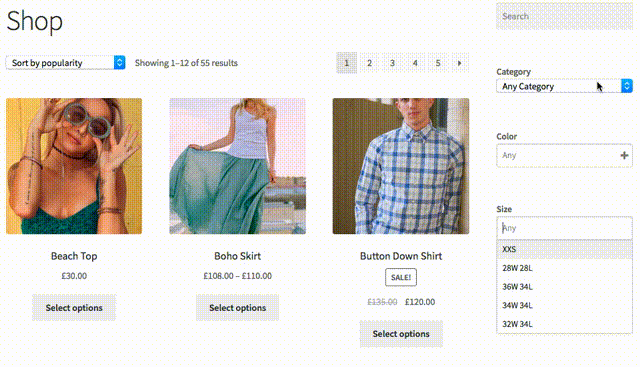
The Product Filter – Categories widget that is part of the WooCommerce Product Search extension provides a live product category filter for your shop. While your customers choose the desired category, it finds matching products and shows them on the shop page.
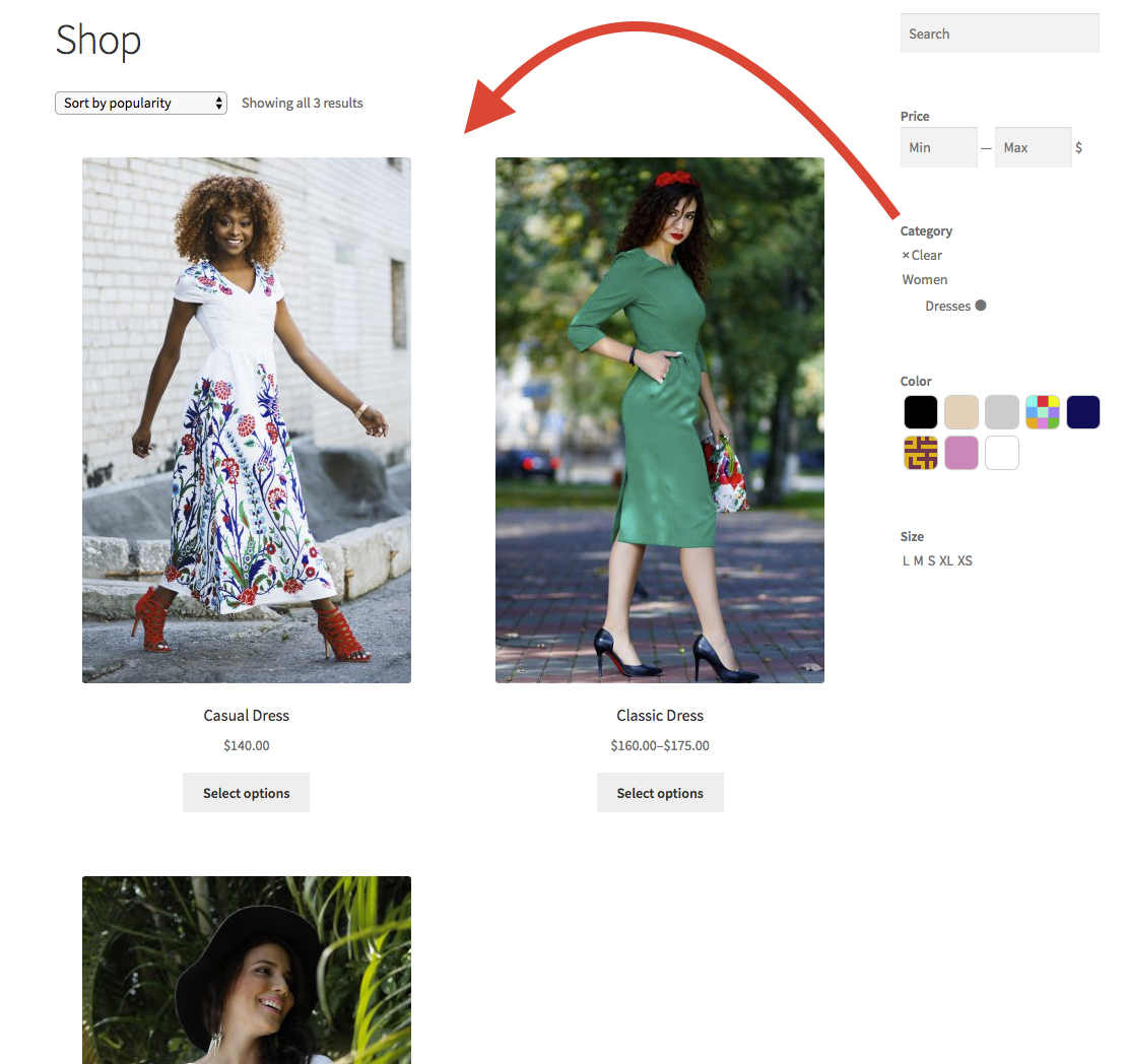
 This live filter shows the product categories which the customer can click. It will update the shop page to include products within the chosen category.
Styles
↑ Back to top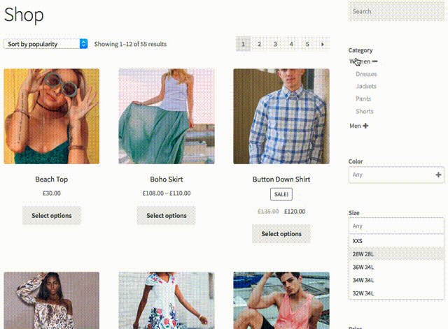 Similar in behavior to the List style, the Inline style renders terms more horizontally.
 The Dropdown style is also searchable and offers settings to show thumbnails both in the list as well as for the chosen terms. It can expand on user interaction or be used with a flexible or fixed height.
 The more traditional Select style is simpler but similar to the Dropdown. Its size can also be specified so you can either use a more compact version or expanded to show a number of terms.
 All of these styles have specific settings that allow you to customize their appearance and create a suitable user experience. Moreover, the attribute filters also offer these styles.
Settings
↑ Back to top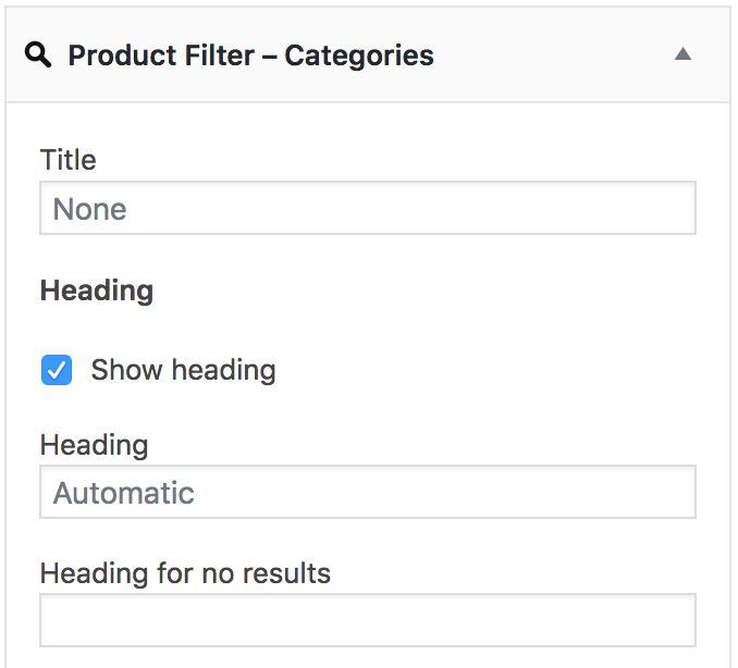 The settings outlined here determine the appearance and behavior of the filter widget.
- The Title field allows you to set the title of the widget. We recommend to leave it empty and have the widget display its heading automatically instead, as it will hide when there are no matching categories to display and show when there are automatically. If you use this title, this is not the case.
Heading
↑ Back to top- Show heading – This option will display the heading for this filter.
- Heading – You can input a customized heading here or leave it empty to use the default. The heading will not be displayed when there are no terms to show.
- Heading for no results – You can input the text of an alternative heading to be displayed when there are no results.
Display
↑ Back to top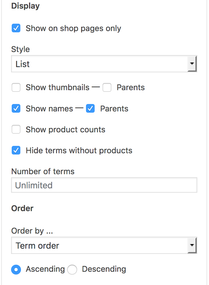
- Show on shop pages only – Use this option to display the widget on relevant shop pages only. This includes the shop page, product tag and product category pages etc.
- Style – Offers options on how to display the terms: List, Inline, Select or Dropdown.
- Show thumbnails / Parents – Enable this option to show thumbnails for the terms. A separate option is provided to show thumbnails for parent terms.
- Show thumbnails for selected – Available when Dropdown is chosen as Style. If enabled, displays thumbnails also for the selected terms.
- Show names / Parents – Enable this option to show the names of the terms. A separate option is provided to show them for parent terms.
- Show product counts – If enabled, the number of related products per term will be shown.
- Hide terms without products – This will automatically hide terms that have no related products.
- Text for no selection – This option is available when Dropdown is selected as Style and determines the text that is shown in the Dropdown field when no item is selected.
- Number of terms – If a number is given, this limits the number of terms shown.
- Size – Available when Select is chosen as Style. Determines the display size of the select box.
- Height – Available when Dropdown is chosen as Style. If left empty, the choices of the dropdown are shown below when the field gains focus. If a plain number is input, e.g. 5, the Dropdown will adopt a fixed height to show the indicated number of entries. If a number with a CSS unit* is used, e.g. 120px, the Dropdown will adopt a fixed height as per the indicated unit. *Allowed CSS units: px, mm, cm, in, pt, pc, em , ex, ch, rem, vw and vh.
- Toggle the component – Hide the filter component when it has no options, “yes” (by default) or “no”.
- Toggle the widget – Hide the widget when the component has no options, “yes” (by default) or “no”.
Order
↑ Back to top- Order by … – Use this option to determine the order in which the terms are shown. You can choose to order them by one of several criteria, such as for example the Name of the term for alphabetical ordering or the Term order to display them as established in the list of product categories.
Navigation
↑ Back to top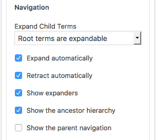 The options in this section determine how the product category hierarchy is presented to the visitor and how it will interact.
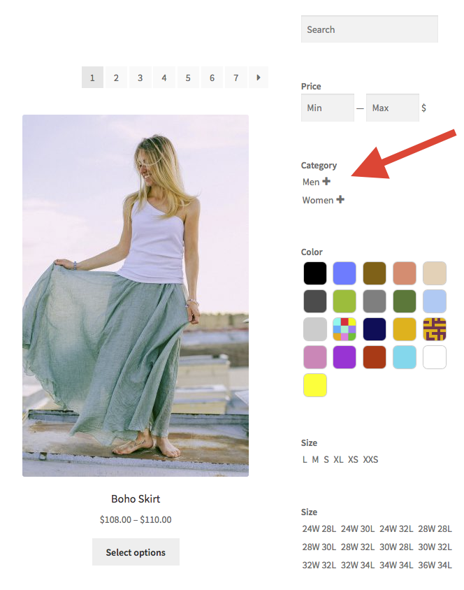
If you use the default values, the root categories will show up and their children are hidden.
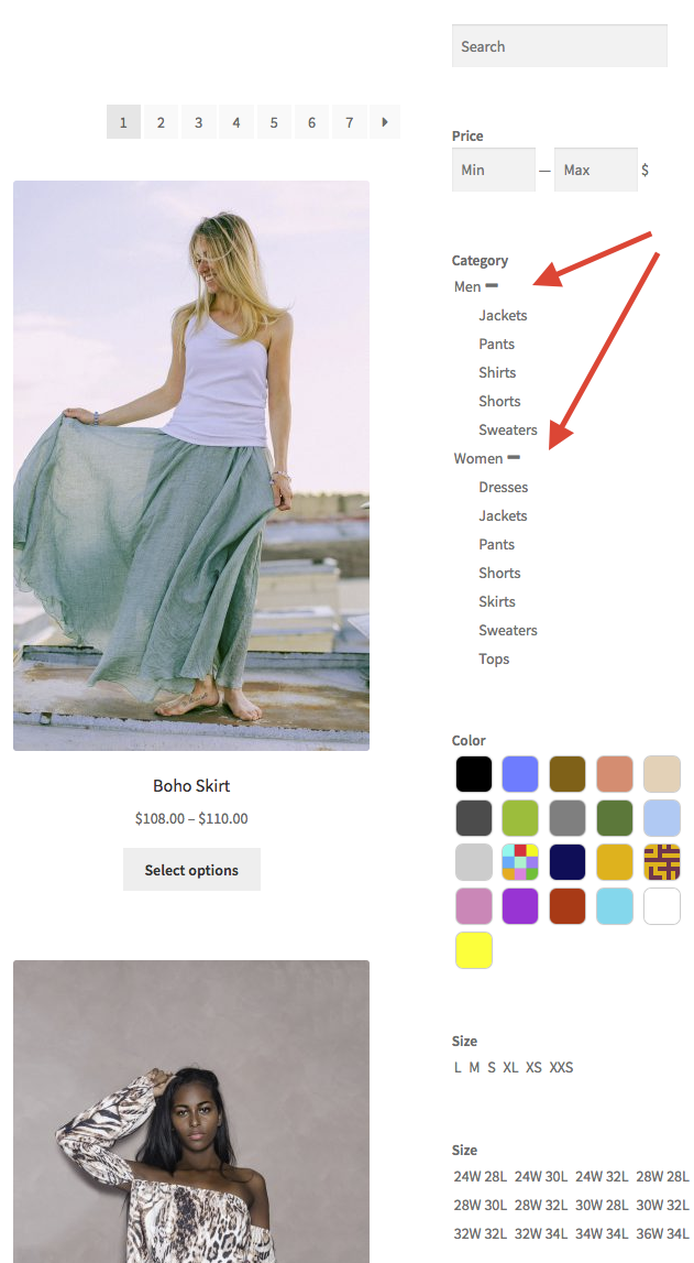
If you hover over a category with children, it will expand and reveal its children. This continues while there are children further down in the hierarchy.
On touch-enabled devices, you can tap the expander symbol for a category to show its children.
Here is an example showing only the root categories with their expanders:
The options in this section determine how the product category hierarchy is presented to the visitor and how it will interact.
If you use the default values, the root categories will show up and their children are hidden.
If you hover over a category with children, it will expand and reveal its children. This continues while there are children further down in the hierarchy.
On touch-enabled devices, you can tap the expander symbol for a category to show its children.
Here is an example showing only the root categories with their expanders:
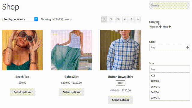
 Here is the same area but now the children of both categories have been expanded:
 The options that control the navigation experience through product categories are:
- Expand Child Terms – Here you can determine at which level categories will hide their children. By default, only the root categories are shown and if they have children, an expander symbol is shown.
- Expand automatically – This is enabled by default so that expandable categories will reveal their children on hover automatically. If you turn it off, you must click the expander explicitly to see the children, just as you need to tap it on touch-enabled devices.
- Retract automatically – When you move outside the area where the categories are shown, the children will automatically be hidden. This is enabled by default.
- Show expanders – This will show expanders and retractors for categories with children.
- Show the ancestor hierarchy – This determines whether the ancestor hierarchy based on the current context is shown.
- Show the parent navigation – If enabled, additional links for ancestors are shown which allow to navigate back in the hierarchy.
Terms
↑ Back to top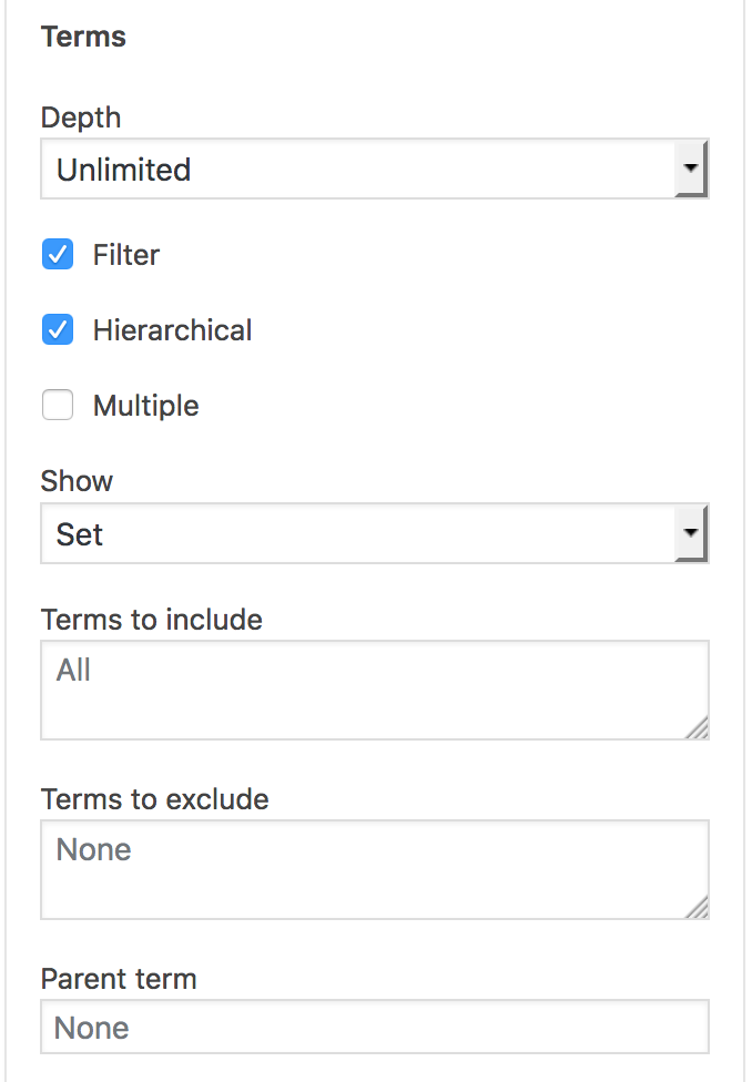
- Depth – This option allows to limit the depth within the term hierarchy.
- Filter – This option should be enabled for live filtering.
- Hierarchical – Whether the terms should be displayed as a hierarchy.
- Multiple – If you want to let visitors select more than one term, enable this option.
- Show – This will determine whether a) All terms are shown, or b) with Set, only those that are within the hierarchy of the selected term are shown.
- Terms to include – You can indicate the terms that should be included here. If left empty, all terms are displayed. Indicate terms by ID, slug or name and separated by comma.
- Terms to exclude – Indicate the terms that should be excluded here by ID, slug or name and separated by comma. If Terms to include are given, they override this field completely – use either of them but not both.
- Parent term – This will limit the terms displayed to children of the one indicated. The token {current} can be used to limit it to children of the current term.
Advanced
↑ Back to top- Heading ID – This sets the ID of the heading element.
- Heading Class – This sets the class of the heading element.
- Heading Element – Here you can choose which HTML tag is used as the heading element.
- Container ID – This sets the ID of the filter’s main div container element.
- Container Class – This adds to the class of the filter’s main div container element.