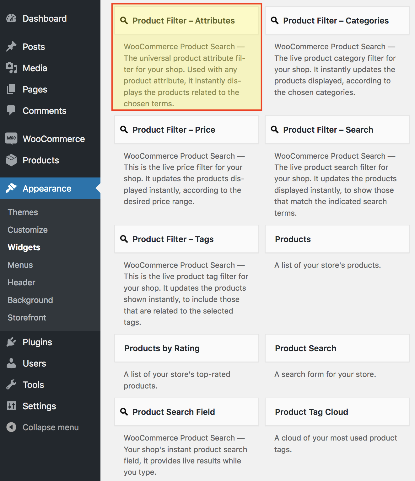
Legacy Widget
↑ Back to topAs of WordPress 5.8, the Block Widgets Editor replaces the previous widgets administration. The widget described here is available as a Legacy Widget when using the new Block Widgets Editor. However, to maintain full widget settings functionality, you must install the Classic Widgets plugin which restores the previous (“classic”) WordPress widgets settings screens.
This page describes a Legacy Widget. With the Block Widgets Editor, we recommend to use the corresponding Product Filter – Attributes block instead. See the Blocks page for an overview of all available blocks with the extension.
The Product Filter – Attributes widget that is part of the WooCommerce Product Search extension provides a live product attribute filter for your shop. While your customers choose the desired terms, it finds matching products and shows them on the shop page.
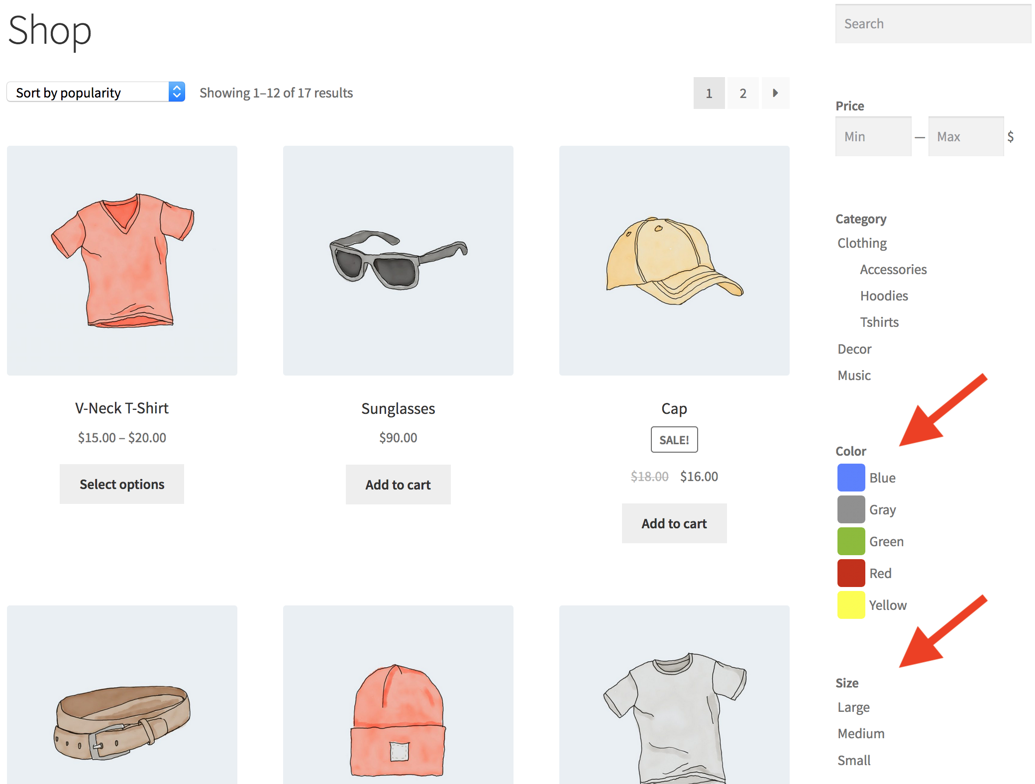
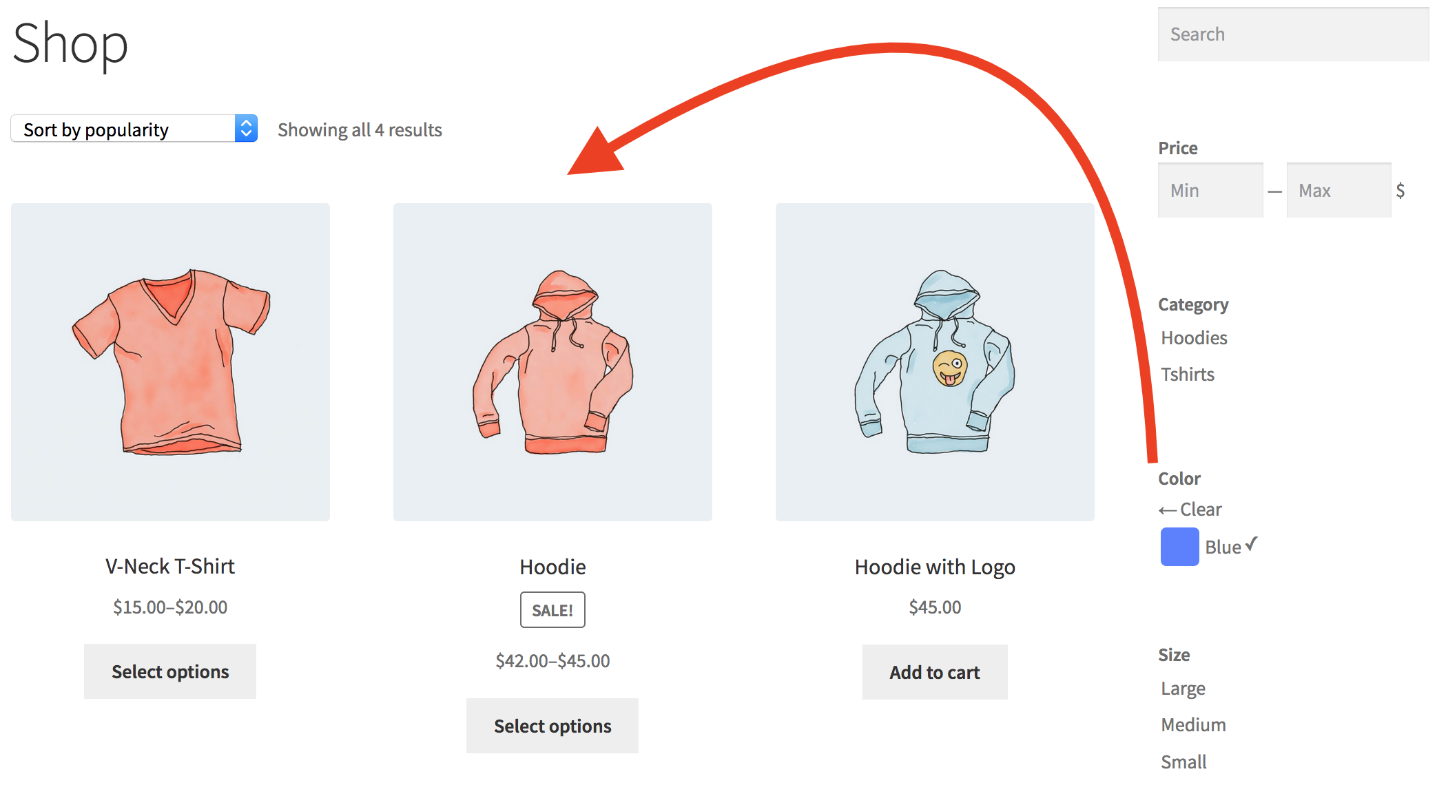
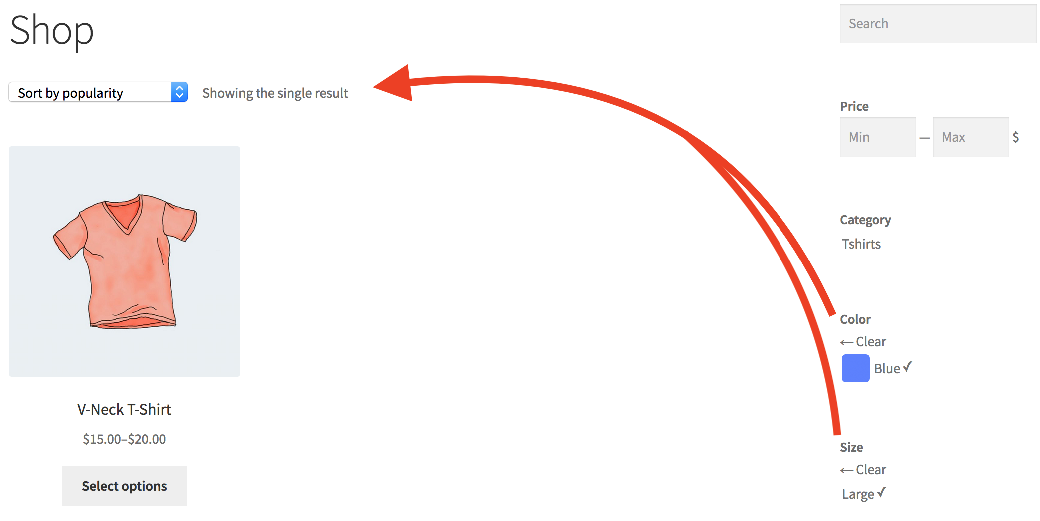
 This live filter displays the terms of a product attribute. The customer can click a term and the shop page will show products that are related to it.
Product attributes are used to identify specific aspects of a product. They can relate common or individual characteristics and features with one or more products. Never use product categories or tags for things like size, color, brand, make, shape, features, etc. Learn how to use Product Attributes for these instead and make managing your products an easy task. Only use global product attributes to relate products to their features.
A typical example for this would be a Color attribute — the live filter would show the different choices of color. In the following examples, two widgets allow to refine the results by choosing a color and a size.
Settings
↑ Back to top
- The Title field allows you to set the title of the widget. We recommend to leave it empty and have the widget display its heading automatically instead. The heading will be hidden when there are no matching terms to display and it will be shown when there are any. If you use the title, this is not the case.
Attribute
↑ Back to top- Attribute – Choose the product attribute for this widget here.
Heading
↑ Back to top- Show heading – This option will display the heading for this filter.
- Heading – You can input a customized heading here or leave it empty to use the default. The heading will be displayed when there are terms to show, it will be hidden when there are none.
- Heading for no results – You can input the text of an alternative heading to be displayed when there are no results.
Display
↑ Back to top- Show on shop pages only – Use this option to display the widget on relevant shop pages only. This includes the shop page, product tag and product category pages etc.
- Style – Offers options on how to display the terms: List, Inline, Select or Dropdown.
- Show thumbnails – Enable this option to show thumbnails for the terms.
- Show thumbnails for selected – Available when Dropdown is chosen as Style. If enabled, displays thumbnails also for the selected terms.
- Show names – Enable this option to show the names of the terms.
- Show product counts – If enabled, the number of related products per term will be shown.
- Hide terms without products – This will automatically hide terms that have no related products.
- Text for no selection – This option is available when Dropdown is selected as Style and determines the text that is shown in the Dropdown field when no item is selected.
- Number of terms – If a number is given, this limits the number of terms shown.
- Size – Available when Select is chosen as Style. Determines the display size of the select box.
- Height – Available when Dropdown is chosen as Style. If left empty, the choices of the dropdown are shown below when the field gains focus. If a plain number is input, e.g. 5, the Dropdown will adopt a fixed height to show the indicated number of entries. If a number with a CSS unit* is used, e.g. 120px, the Dropdown will adopt a fixed height as per the indicated unit. *Allowed CSS units: px, mm, cm, in, pt, pc, em , ex, ch, rem, vw and vh.
- Toggle the component – Hide the filter component when it has no options, “yes” (by default) or “no”.
- Toggle the widget – Hide the widget when the component has no options, “yes” (by default) or “no”.
Order
↑ Back to top- Order by … – Use this option to determine the order in which the terms are shown.
Terms
↑ Back to top- Filter – This option should be enabled for live filtering.
- Multiple – If you want to let visitors select more than one term, enable this option.
- Show – This will determine whether a) All terms are shown, or b) with Set, only those that are within the context of the selected term are shown.
- Terms to include – You can indicate the terms that should be included here. If left empty, all terms are displayed. Indicate terms by ID, slug or name and separated by comma.
- Terms to exclude – Indicate the terms that should be excluded here by ID, slug or name and separated by comma. If Terms to include are given, they override this field completely – use either of them but not both.
Advanced
↑ Back to top- Heading ID – This sets the ID of the heading element.
- Heading Class – This sets the class of the heading element.
- Heading Element – Here you can choose which HTML tag is used as the heading element.
- Container ID – This sets the ID of the filter’s main div container element.
- Container Class – This adds to the class of the filter’s main div container element.