The HTML produced for a Product Search Field, its equivalent [woocommerce_product_search] shortcode or the API function is shown below. When you want to review an instance of the Product Search Field, you can observe the according HTML in your browser’s Web Inspector. The field’s code will usually be embedded within a widget container or similar, depending on what has been used to place an instance of it on a page. Depending on the instance that is generated, there can be slight differences in element IDs.
<div id="product-search-0" class="product-search floating">
    <div class="product-search-form">
        <form id="product-search-form-0" class="product-search-form show-submit-button" action="http://example.com/" method="get">
            ::before
            <input id="product-search-field-0" name="s" type="text" class="product-search-field" placeholder="Search products …" autocomplete="off">
            <input type="hidden" name="post_type" value="product">
            <input type="hidden" name="title" value="1">
            <input type="hidden" name="excerpt" value="1">
            <input type="hidden" name="content" value="1">
            <input type="hidden" name="categories" value="1">
            <input type="hidden" name="attributes" value="1">
            <input type="hidden" name="tags" value="1">
            <input type="hidden" name="sku" value="1">
            <input type="hidden" name="orderby" value="date-DESC">
            <input type="hidden" name="ixwps" value="1">
            <span title="Clear" class="product-search-field-clear" style="display:none"></span>
            <button type="submit">Search</button>
        </form>
    </div>
    <div id="product-search-results-0" class="product-search-results">
        <div id="product-search-results-content-0" class="product-search-results-content" style="display: none;"></div>
    </div>
</div>
product-search-0,product-search-form-0,product-search-field-0,product-search-results-0
product-search-1,product-search-form-1,product-search-field-1,product-search-results-1
- Adding a border to the Product Search Field
- Styling the Search Icon
- Changing the Search Icon
- Styling the Results
- Adding a border to the Results Container
- Styling the Add-To-Cart Buttons
- Styling the Clear Icon
Adding a border to the Product Search Field
↑ Back to top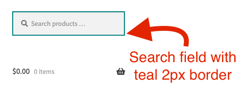 The HTML elements of interest could be any of the outer containers or the input field itself …
<div id="product-search-0" class="product-search floating">
<input id="product-search-field-0" name="s" type="text" class="product-search-field" ...>
- #product-search-0
- #product-search-field-0
- div.product-search or div.product-search-form
- .product-search .product-search-form .product-search-field
#product-search-0 { border: solid 2px teal; }
#product-search-field-0 { border: solid 2px teal; }
Styling the Search Icon
↑ Back to top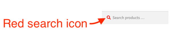
#product-search-form-0 and specifically its ::before pseudo–element.
#product-search-form-0::before {
    color: #ff0000;
}
Changing the Search Icon
↑ Back to top For example, assume we wanted to change the default search icon to a teal 18p search-plus icon, we would have to get the Unicode for this icon:
 \f00e
Notice the use of the backward slash before the Unicode value itself. This is because it is required in order to render on the browser. Here’s a link to FontAwesome’s Cheatsheet with lots of icons.
The HTML element of interest is the ::before pseudo-element found within the form. To target it, we can use the form’s ID.
This is the CSS rule we have used to change the search icon in this example:
#product-search-form-0::before {
    content: "\f00e";
    font-size: 18px;
    color: teal;
    margin: -4px -7px;
}
content: "\f00e"; while the other CSS properties, simply change the color, font size and margin.
Styling the Results
↑ Back to top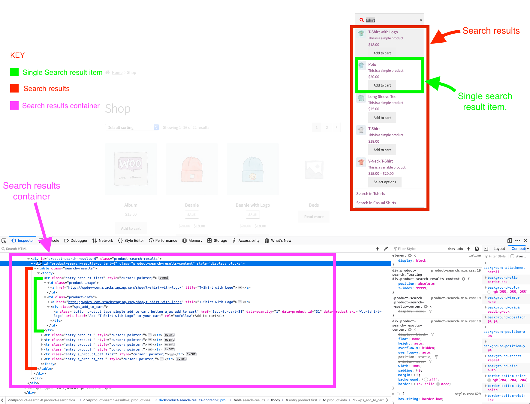
Adding a border to the Results Container
↑ Back to top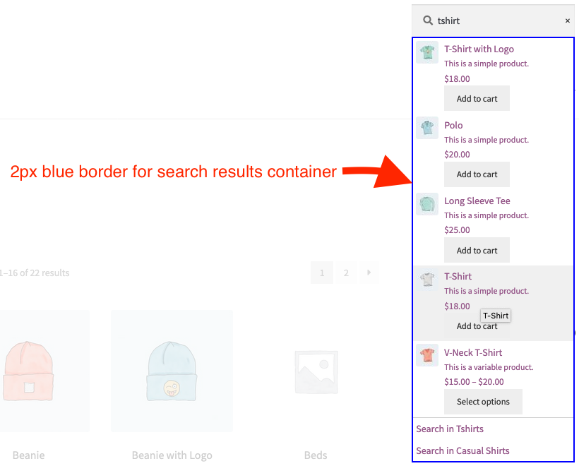 The HTML element of interest is the container that surrounds the results, so let’s apply a CSS rule that adds a blue border to it:
- ID we are interested in:
CSS used:
#product-search-results-content-0
    #product-search-results-content-0 {
        border: solid 2px blue;
    }
Styling the Add-To-Cart Buttons
↑ Back to top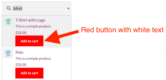 HTML elements of interest:
<div id="product-search-0" class="product-search floating">
...
<a ... class="button product_type_simple add_to_cart_button ajax_add_to_cart">Add to cart</a>
#product-search-0 as the container element’s ID
.wps_add_to_cart and .add_to_cart_button as the Add-To-Cart elements’ classes
#product-search-0 .wps_add_to_cart .add_to_cart_button {
    background-color: red;
    color: white;
}
Styling the Clear Icon
↑ Back to top
- HTML elements of interest:
    <div id="product-search-0" class="product-search floating">
    <span title="Clear" class="product-search-field-clear" style=""></span>
- ID and class we are interested in:
CSS used:
    #product-search-0 , for ID
    .product-search-field-clear for class
    #product-search-0 .product-search-field-clear {
        font-size: 30px;
        color: red;
    }
Notes
↑ Back to topChild Themes vs. Inline Stylesheet
↑ Back to top