This section of the tutorial focuses more on styling the Product Filter – Categories.
We will be exploring how to change the look and feel of the Product Filter – Categories.
Though we assume you know your way around with CSS rules, here are some good resources to help refresh your mind on CSS rules and how to target HTML elements with CSS.
Customizing Product Filter – Categories with style option set to List:
↑ Back to topOnce the widget or shortcode of Product Filter – Categories is placed on your site, you should have the following HTML structure:
<div id="product-search-filter-category-0" class="product-search-filter-terms ">
    <div class="product-search-filter-terms-heading product-search-filter-category-heading" id="product-search-filter-category-heading-0">Category</div>
    <ul>
        <li> <a href=""> </a> </li>
        <li> <a href=""> </a> </li>
        <li> <a href=""> </a> </li>
        ...
    </ul>
</div>
Notes:
The ID ( product-search-filter-category-0) is likely to be different on your setup. Hence, please inspect the element using your browser inspector to identify the ID.
Here’s a list of the top customization requests received for Product Filter – Categories:
- Display only child categories
- Change the font color of parent categories
- Styling active(selected) term(category)
Display only child categories:
↑ Back to topThis is one of our most popular inquiries. If you would love to hide the parent categories and have only the child categories displayed. Please add the CSS snippet below.
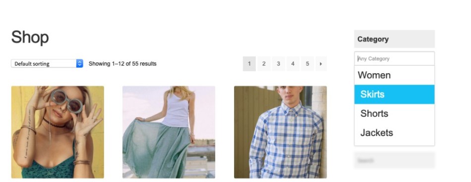
This customization requires you to set the Expand Child Terms option to Expand Child Terms in the navigation section of the Product Filter – Categories widgets settings
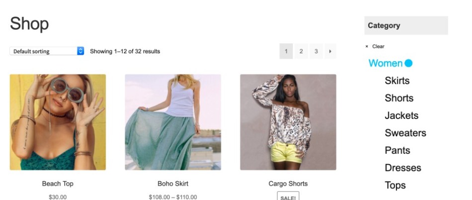
This is the appearance of Product Filter – Categories with parent categories visible before we apply our customizations:
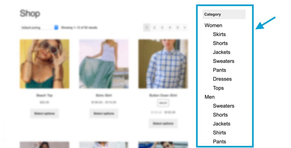
CSS IDs and classes we are interested in:
#product-search-filter-category-0, .cat-parent, .children
These are the CSS rules we apply:
#product-search-filter-category-0 .cat-parent{
    visibility: hidden;
    margin-top: -30px;
}
#product-search-filter-category-0 .cat-parent .children {
    visibility: initial;
    margin: 0;
}
With the above CSS rules applied, here’s how the Product Filter – Categories now looks within the context of our demo store with the parent categories removed…

Change font color of parent categories:
↑ Back to topIn this example, we will be changing the color of the parent categories to a shade of blue( #16c0f4 ).
This is the appearance of Product Filter – Categories with parent categories visible before we apply our customizations:
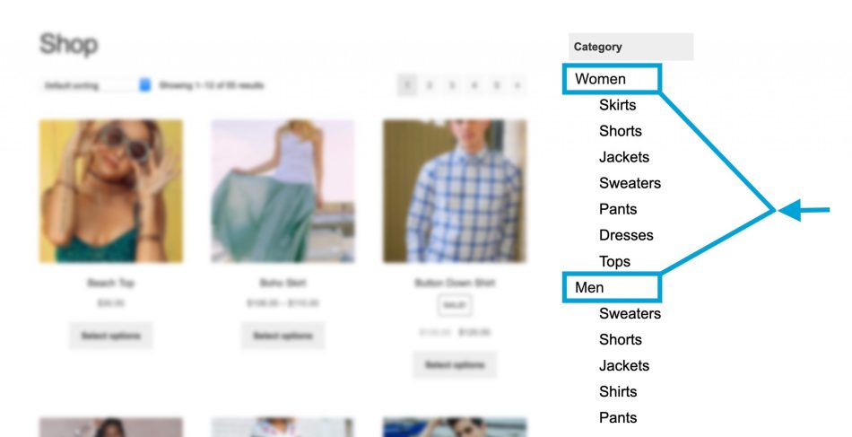
CSS IDs and classes we are interested in:
#product-search-filter-category-0, .cat-parent, .children
#product-search-filter-category-0 .cat-parent a {
    color: #16c0f4;
}
#product-search-filter-category-0 .cat-parent .children a {
    color: #000;
}
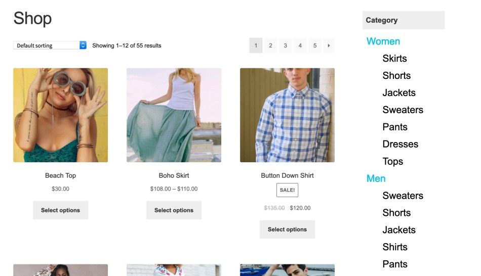
With the above CSS rules applied, here’s the result within the context of our demo store…
Styling active(selected) term(category):
↑ Back to topIn this section, we will focus on styling a category(term) that is selected, by setting the selected category’s color to a shade of blue(#16c0f4).
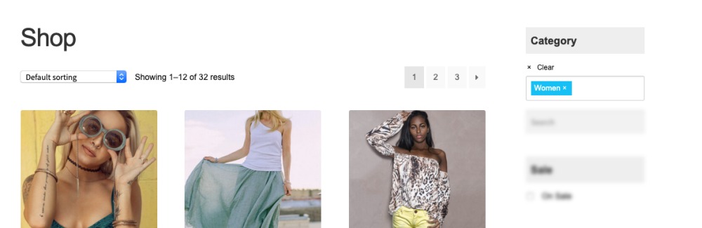
For instance, we will consider the user has selected the Women category from the Product Filter – Categories widget.
Appearance before we apply our customizations:
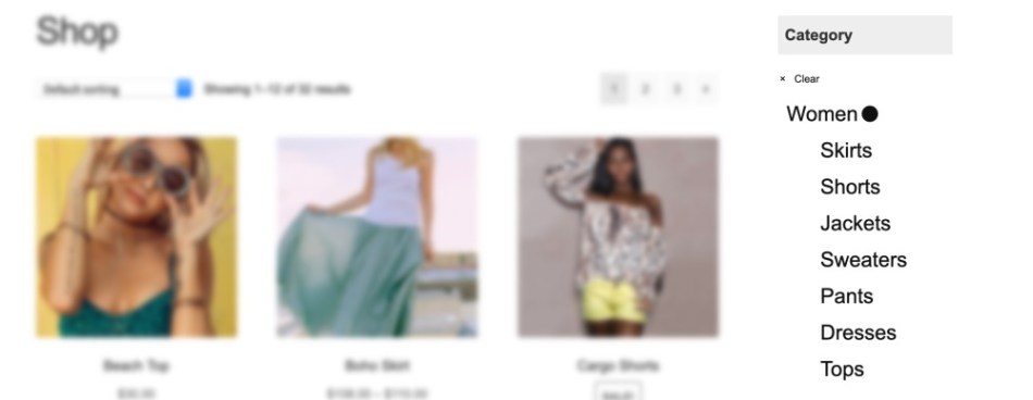
CSS IDs and classes we are interested in:
#product-search-filter-category-0, .product-search-product_cat-filter-item, .current-cat
.product-search-product_cat-filter-item.current-cat > a {
    color: #16c0f4;
}
With the above CSS rules applied, here’s the result within the context of our demo store…
Customizing Product Filter – Categories with style option set to Dropdown:
↑ Back to topOnce the widget or shortcode of Product Filter – Categories is placed on your site and the style option set to Dropdown, you should have the following HTML structure:
<div id="product-search-filter-category-0">
    <div class="product-search-filter-select-product_cat-selectize">
        <div class="selectize-input items"></div>
        <div class="selectize-dropdown multi product-categories">
            <div class="selectize-dropdown-content">
                <div class="option">....</div>
                <div class="option">....</div>
                ...
            </div>
        </div>
    </div>
</div>
Notes:
The ID ( product-search-filter-category-0) is likely to be different on your setup. Hence, please inspect the element using your browser inspector to identify the ID.
Examples covered:
- Change the background color of selected items
- Add hover background color to dropdown options
Change the background color of selected items:
↑ Back to topIn this example, we’ll focus on changing the background color of selected items(categories) to teal and its color to white.
Appearance before we apply our customizations:

CSS IDs and classes we are interested in:
#product-search-filter-category-0, .has-options, .item
#product-search-filter-category-0 .has-options .item {
    background-color: #16c0f4;
    color: white;
    padding: 4px 5px;
    line-height: initial;
}
With the above CSS rules applied, here’s the result within the context of our demo store…
Add hover background color to dropdown options:
↑ Back to topThis example demonstrates how you could go about adding a hover background color to the dropdown options.
Appearance before we apply our customizations:
CSS IDs and classes we are interested in:
#product-search-filter-category-0
#product-search-filter-category-0  .selectize-dropdown .option:hover {
    background-color: #16c0f4;
    color: #fff;
}
With the above CSS rules applied, here’s the result within the context of our demo store…
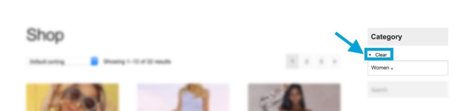
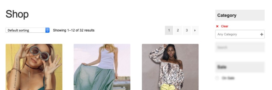
Change style of “clear” icon and text when a category is selected:
↑ Back to topIn this section, we demonstrate how you would go about adding a font color of red to the Clear action that is displayed after a user has selected a category.
Appearance before we apply our customizations:
CSS IDs and classes we are interested in: (In order to style the cancel icon by the Clear label we would also be interested in the psuedo-element; ::before)
#product-search-filter-category-0, .nav-back
/* Styling the icon */
.product-search-filter-terms .nav-back::before{
    color: red;
    padding: 0;
    font-size: 20px;
}
/* Styling the label - Clear */
.product-search-filter-terms .nav-back a{
    color: red;
}
With the above CSS rules applied, here’s the result within the context of our demo store…
How to apply Custom Styles
↑ Back to topYou can apply your custom styles in a child theme or you can use the extension’s CSS settings to apply inline styles.
- Go to WooCommerce > Settings > Search > CSS.
- Make sure the Use inline styles option is enabled.
- Paste your CSS rules in the Inline styles field provided and save the settings.