This section focuses on styling our product attribute filters, which are produced by the Product Filter – Attributes widget, its equivalent [woocommerce_product_filter_attribute] shortcode or the API function. We will be exploring the structural HTML elements and related CSS and learn how to apply customizations that allow to change the appearance of the elements involved. For this section, you might want to refresh your knowledge on Product Attributes and how the are used in WooCommerce. Please also make sure to have read and understood the related section of the documentation as referenced above, on the widget, shortcode or API function you are going to use to display the attribute filter. We will refer to any instance of those generically as the product attribute filter or simply attribute filter below. Though we assume that you know your way around with HTML and CSS rules, here are some good resources to help refresh your mind on CSS rules and how to target HTML elements with CSS. You will find additional references that show ways to include the customizations at the end of this article.
The examples we outline below are based on StoreSearch, a Storefront child theme we provide freely.Customizing the Product Attribute Filter using List Style
↑ Back to top<div class="widget widget_woocommerce_product_search_filter_attribute_widget">
<div class="product-search-filter-terms-heading product-search-filter-attribute-heading" id="product-search-filter-attribute-heading-0">Color</div>
<ul class="product-attribute product-search-filter-items style-inline">
<li class="product-search-attribute-filter-item"> <a href=""> <img src="..."/> </a> </li>
<li class="product-search-attribute-filter-item"> <a href=""> <img src="..."/> </a> </li>
<li class="product-search-attribute-filter-item"> <a href=""> <img src="..."/> </a> </li>
...
</ul>
</div>
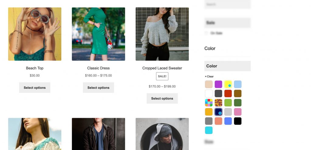
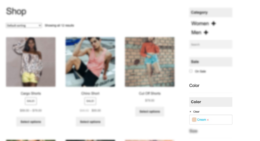
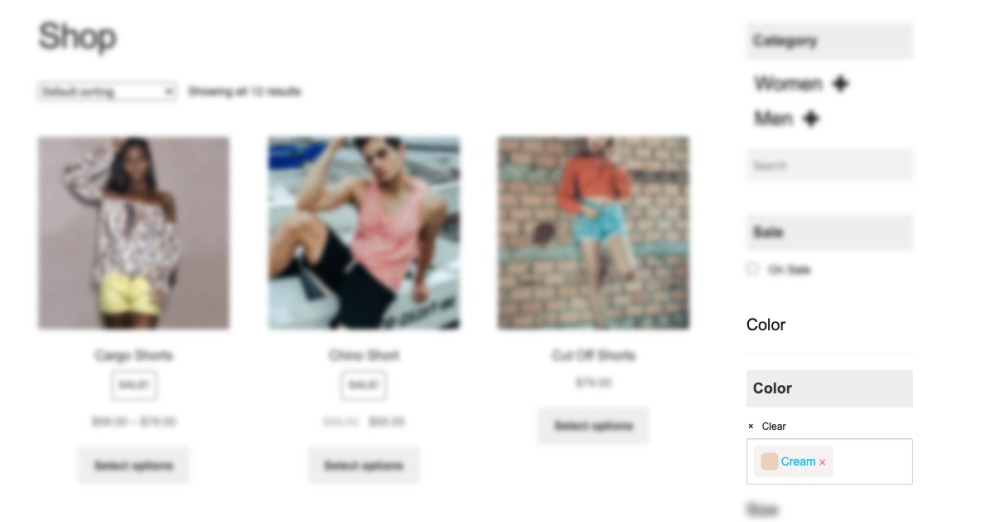
A common customization request is to modify the style of the selected item or items in the attribute filter.
Styling the selected Item
↑ Back to top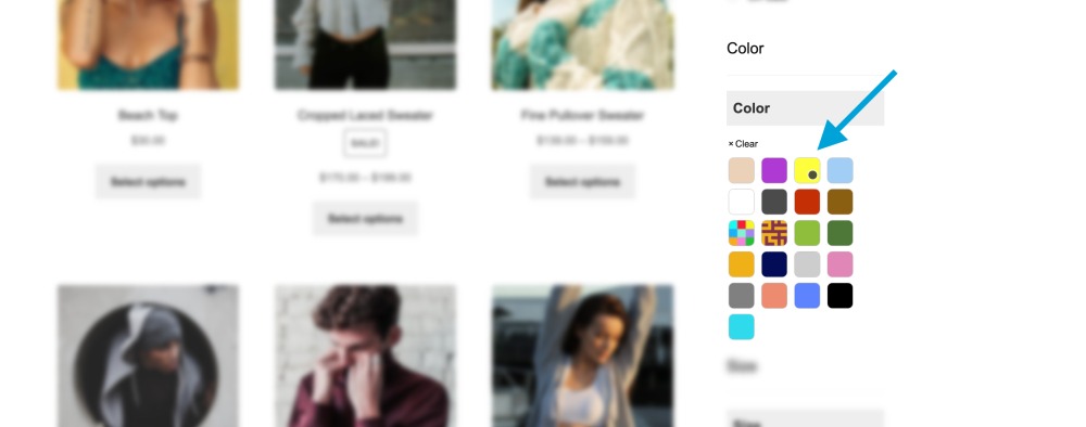 CSS IDs and classes we are interested in:
.product-search-attribute-filter-item, .current-attributeThese are the CSS rules we apply:
/* Style for currently selected attribute */
.product-search-attribute-filter-item.current-attribute img {
    filter: blur(0.15rem);
    border-color: #16c0f4;
}
/* Style to keep all the other unselected attribute terms sharp and NOT blurred */
.product-search-attribute-filter-item img {
    filter: blur(0);
}
/* Changing the color of the circular indicator which appears on selected attribute terms*/
.product-search-attribute-filter-item.current-attribute > a::after{
    color: #16c0f4 !important;
}
With the above CSS rules applied and two colors selected, yellow and navy blue, here’s how the filter looks within the context of our demo store:
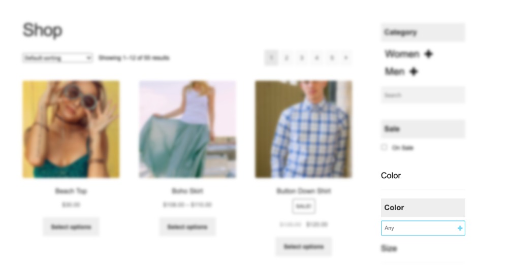
Customizing the Product Attribute Filter using Dropdown Style
↑ Back to top<div class="product-search-filter-terms">
<div class="product-search-filter-attribute-heading"></div>
<select class="product-search-filter-items product-search-filter-attribute ...">
<option selected="selected"></option>
</select>
<div class="product-search-filter-toggle product-search-filter-items ...">
<div class="selectize-input items">
<input />
</div>
<div class="selectize-dropdown ...">
<div class="selectize-dropdown-content">
<div class="option">
<span class="option-padding"></span>
<span class="option-thumbnail">
<img class="term-thumbnail" />
</span>
<span class="option-label"></span>
</div>
</div>
</div
Examples covered:
- Styling the Clear icon for a selected color term and improving the aesthetics of the selected color term.
- Styling the dropdown’s input field.
Styling the Clear Icon
↑ Back to top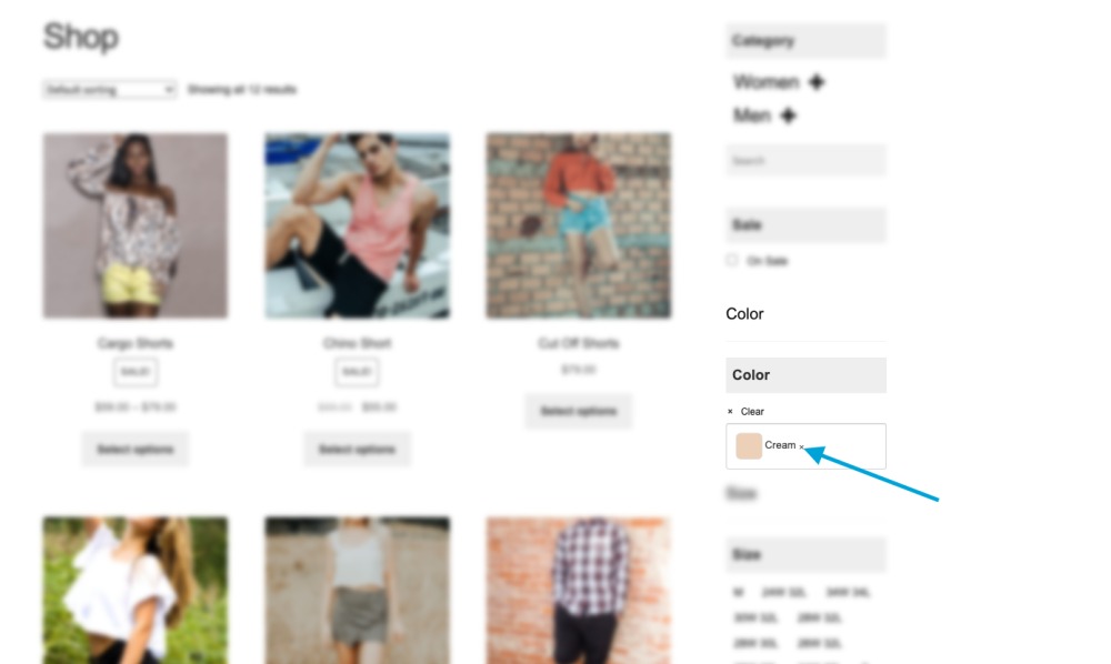 CSS IDs and classes we are interested in:
#product-search-filter-attribute-0, .product-search-filter-toggle, .selectize-input, .remove-singleCSS rules to apply:
.product-search-filter-toggle .selectize-input .remove-single {
    color: rgb(255 0 0 / .6);
    font-size: 14px;
    vertical-align: middle;
}
With the above CSS rule applied, here’s the result within the context of our demo store:
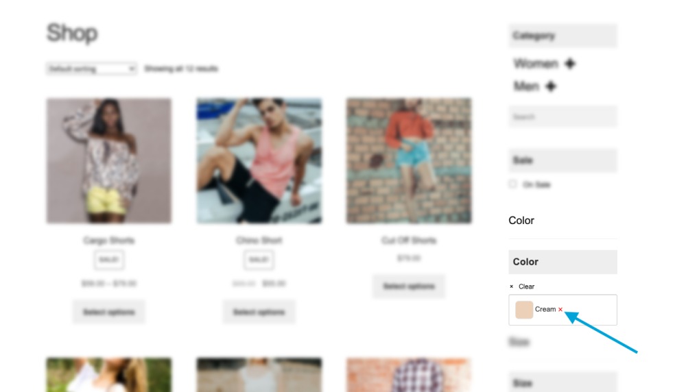 In addition to the above CSS rule, if you would like to reduce the size of the color thumbnail and change the label color of the selected term, you could add the following CSS rule:
/* Reducing the thumbnail size of the selected color term  */
.product-search-filter-terms .product-search-filter-attribute .term-thumbnail {
    width: 20px;
    height: 100%;
    object-fit: contain;
    font-size: 14px;
}

/* Changing the color and font-size of the label to a shade of blue and vertically aligning it to the center*/
.product-search-filter-terms .product-search-filter-attribute .option-label {
    vertical-align: middle;
    color: #16c0f4;
    font-size: 14px;
}
With the above CSS rules applied, here is the result within the context of our demo store:
 Next, if you would want to set a background color to the selected color filter, then you could use the following CSS rule:
.product-attribute product-search-filter-items .selectize-input .option {
    background-color: #f7f2f2;
    border-radius: 5px;
    padding: 5px;
}
Again with the above CSS rule applied, here is the updated result:
Styling the Dropdown’s Input Field
↑ Back to top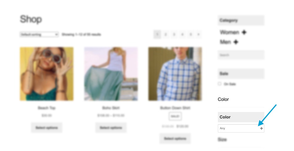 CSS IDs and classes we are interested in:
#product-search-filter-attribute-0, .product-attribute product-search-filter-items, .selectize-control, .single, .selectize-inputCSS rule to apply:
.product-attribute product-search-filter-items .selectize-control.single .selectize-input,
.product-attribute product-search-filter-items .selectize-control .selectize-input:after {
    border-color: #16c0f4;
    color: #16c0f4;
}
With the new rules in place, our dropdown now appears as shown below:
 While our examples are certainly not exhaustive, we believe that they will help you to start making your own customizations easier.
How to apply Custom Styles
↑ Back to top- Go to WooCommerce > Settings > Search > CSS.
- Make sure the Use inline styles option is enabled.
- Paste your CSS rules in the Inline styles field provided and save the settings.