This block is provided with the WooCommerce Product Search extension as of version 4.0.0.
The Product Filter – Tags block which comes with the WooCommerce Product Search extension provides a live product tag filter for your shop. While your customers choose the desired tag, it finds matching products and shows them on the shop page.
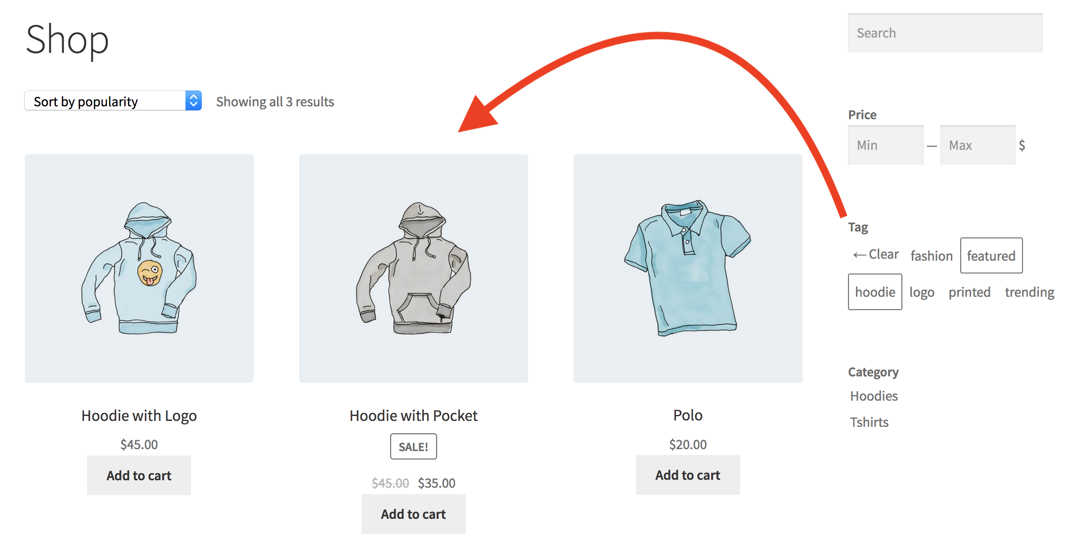
 This live filter displays product tags. It allows the customer to click a tag and updates the shop page to show products that are related to it.
 The following settings are provided to fine-tune the appearance and behavior of the block.
Settings
↑ Back to topDisplay
↑ Back to top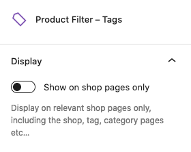
- Show on shop pages only – Use this option to display the block on relevant shop pages only. This includes the shop page, product tag and product category pages etc. We recommend to leave this option disabled if you place the block directly on a page which is not a shop page, enable it if you place it in a sidebar that should show the block for shop pages.
User Interface
↑ Back to top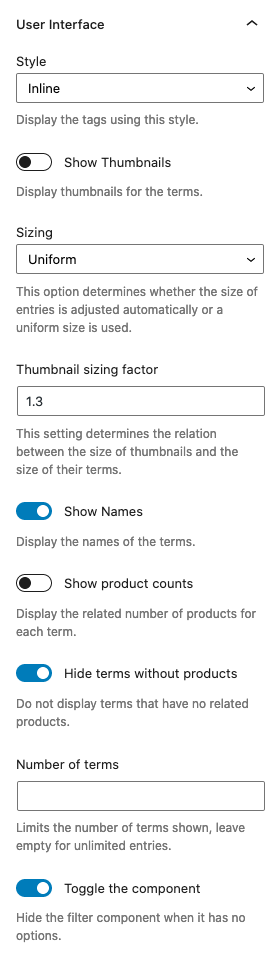
- Style – Offers options on how to display the terms, as a list or in-line.
- Show thumbnails – Enable this option to show thumbnails for the terms.
- Sizing – This option controls whether the size of the entries is uniform or adjusted automatically.
- Thumbnail sizing factor – The number provided sets the relation between thumbnails and their terms.
- Show names – Enable this option to show the names of the terms.
- Show product counts – If enabled, the number of related products per term will be shown.
- Hide terms without products – This will automatically hide terms that have no related products.
- Number of terms – If a number is given, this limits the number of terms shown.
- Toggle the component – Hide the filter component when it has no options, is enabled by default and can be disabled.
Order
↑ Back to top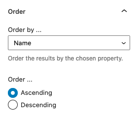
- Order by … – Use this option to determine the order in which the terms are shown.
Terms
↑ Back to top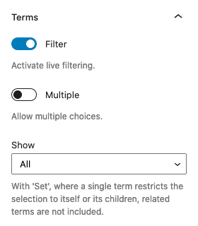
- Filter – This option should be enabled for live filtering.
- Multiple – If you want to let visitors select more than one term, enable this option.
- Show – This will determine whether a) All terms are shown, or b) with Set, only those that are within the selection.
Heading
↑ Back to top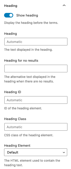
- Show heading – This option will display the heading for this filter.
- Heading – You can input a customized heading here or leave it empty to use the default. The heading will not be displayed when there are no terms to show.
- Heading for no results – You can input the text of an alternative heading to be displayed when there are no results.
- Heading ID – This sets the ID of the heading element.
- Heading Class – This sets the class of the heading element.
- Heading Element – Here you can choose which HTML tag is used as the heading element.
Container
↑ Back to top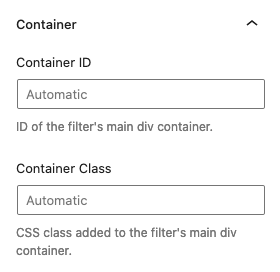
- Container ID – This sets the ID of the filter’s main div container element.
- Container Class – This adds to the class of the filter’s main div container element.