The Product Table extension for WooCommerce lets you list products and represent them as a responsive table. Is perfect for product list views, order forms, wholesale, product catalogues.
Getting started
↑ Back to topProduct Table Installation
↑ Back to top
- In the left admin panel of WordPress, click Plugins > Add New.
- Search for “WooCommerce Product Table by WooBeWoo” and click “Install”. When the installation is completed, click “Activate Plugin”.
- You will see a new plugin, ready to work in the admin menu.
- Download the zip archive with PRO version
- Navigate to Plugins > Add New > Upload the archive > Activate Plugin.
- After activation of the PRO version, move to WooCommerce -> Subscription
- Connect to WooCommerce.com if you are not connected
- Search for Product Table for WooCommerce and press “Active”.
Create a new table
↑ Back to top- Click “Add new table”
- Enter the title of the table.
- Select the products or skip this step.
- Click “OK”.
Add products to the Product table
↑ Back to topManually
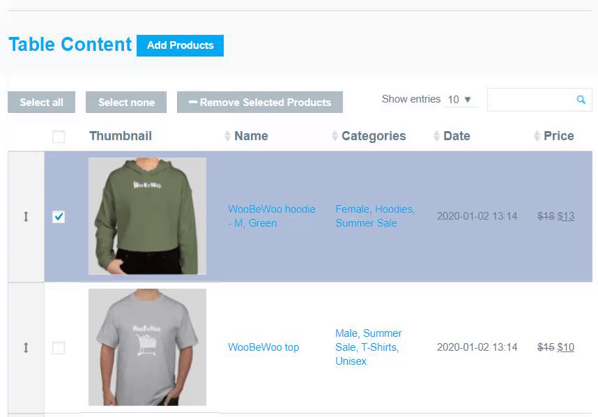
Select the necessary items and add them to Manage Table Content.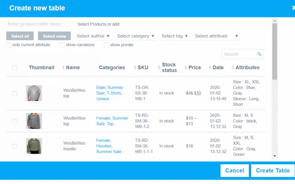 You can select all the products at once or filter them by:
- category
- attribute
- author
- tag
- in a table: yes/no
- name
- SKU
- price
- date and other parameters
- only current attribute – filter by attribute will display the single attribute exactly matches the search criteria.
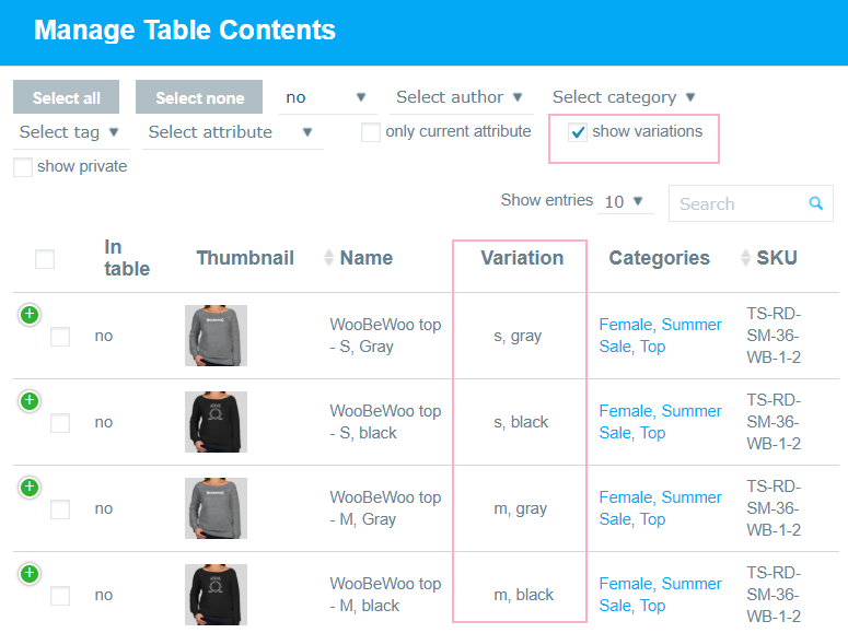
- show variation – display the variation of the variable product separately.
- show private – display private products on the list.
Automatically
The way to easily add products automatically to the Product Table by category – just choose categories from the drop-down list: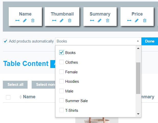 If you add products in this way, you don’t need to edit table un future, adding new products. All the new products you will add to your shop will be automatically added to the table according to the selected category.
Set the product table properties
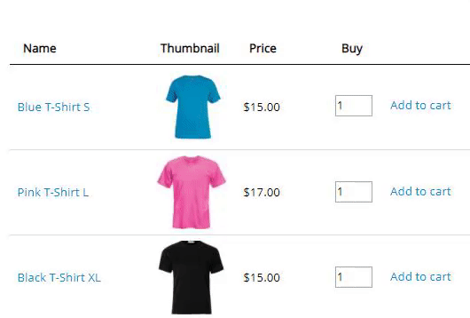
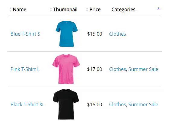
↑ Back to top- Thumbnails
- Name
- Featured
- SKU
- Categories
- Attributes
- Summary
- Rating
- Stock status
- Date
- Price
- Buy
- Short description
- Sales
- Downloads
- Sale Price dates
- Product link
- Tags
- Custom fields
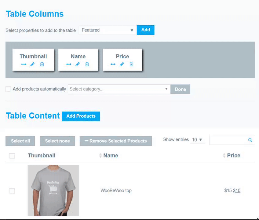 You can click an edit column to set the edition settings.
Click the Save button and check the created Product table in preview mode.
Make the other settings. More detailed information about the features you can find below.
There are 2 different ways to add a table to your site using code: table shortcode and table PHP code.
Table shortcode can be found on the left navigation menu if you click “Show All Tables”.
You can click an edit column to set the edition settings.
Click the Save button and check the created Product table in preview mode.
Make the other settings. More detailed information about the features you can find below.
There are 2 different ways to add a table to your site using code: table shortcode and table PHP code.
Table shortcode can be found on the left navigation menu if you click “Show All Tables”.
 Or you can also find shortcodes in the table settings in the top left of the panel. Simply choose a necessary code from the drop-down menu and copy the code.
 Copy Table shortcode and paste into the page content. PHP code can be inserted at any place of the page code.
Product table columns settings
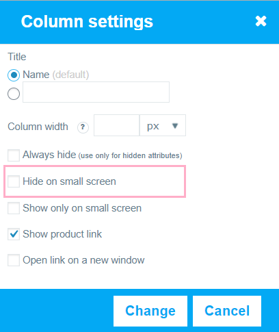
↑ Back to top Name. Use the default title of the column or rename it and enable the field for the custom title.
Column width. This setting sets the maximum width for the column, but the rest of the table content also affects its width – check how it looks on Preview.
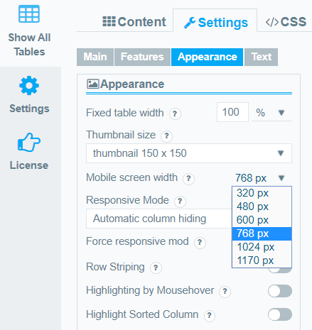
Enable “Hide/show on small screens” if you want to make this column hidden. The screen size you can set in the Appearance tab:
Name. Use the default title of the column or rename it and enable the field for the custom title.
Column width. This setting sets the maximum width for the column, but the rest of the table content also affects its width – check how it looks on Preview.
Enable “Hide/show on small screens” if you want to make this column hidden. The screen size you can set in the Appearance tab:
 Check the last setting if you need to open the link on a new window.
Show product link – disable is you don’t need to make name clickable.
Responsive mode thumbnail size (for Thumbnails) – Set the size in the pixels to display full-size thumbnails on mobile.
Cut description text (for Summary and Short description) – set the number of characters of text to display in the column.
Show icons/text -(for Stock Status) – select in which way to display status – as an icon, text or both.
Show quantity items in-stock (for Stock Status) – display the quantity of available product. The option works with variable products too.
Show as an icon, text or image (for Features). You can select the icon or upload the image to display
Display download link as an icon, button, link, audio, video (for Downloads). For displaying links you need to fill up the downloadable files form in product settings.
Check the last setting if you need to open the link on a new window.
Show product link – disable is you don’t need to make name clickable.
Responsive mode thumbnail size (for Thumbnails) – Set the size in the pixels to display full-size thumbnails on mobile.
Cut description text (for Summary and Short description) – set the number of characters of text to display in the column.
Show icons/text -(for Stock Status) – select in which way to display status – as an icon, text or both.
Show quantity items in-stock (for Stock Status) – display the quantity of available product. The option works with variable products too.
Show as an icon, text or image (for Features). You can select the icon or upload the image to display
Display download link as an icon, button, link, audio, video (for Downloads). For displaying links you need to fill up the downloadable files form in product settings.
Note: all the features values are synced with WooCommerce, so you can’t edit its content directly; to manage any of them, you need to change product properties via WooCommerce Product editing.
Product Table Settings
↑ Back to topMain settings
↑ Back to top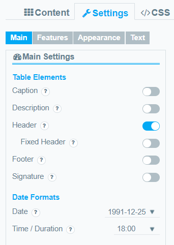 Caption. Check if you want to show the name of the table above the table.
 Description. You can add a short description to the table between title and table.
 Signature. You can add a signature under table footer.
 Header. Check if you want to show the table head.
 Footer. Check if you want to show the table footer.
 Fixed Header allows fixing the table’s header during table scrolling.
Important! Header option must be enabled for using this feature.Date. Let the output format for the date. For example: y-m-d- 1991-12-25, d.m.y – 25.12.1991 Time / Duration. The set output format for time and duration. For example: 1) time – H:m – 18:00, h:m a – 9:00 pm 2) duration h:m – 36:40, h:m:s – 36
Features
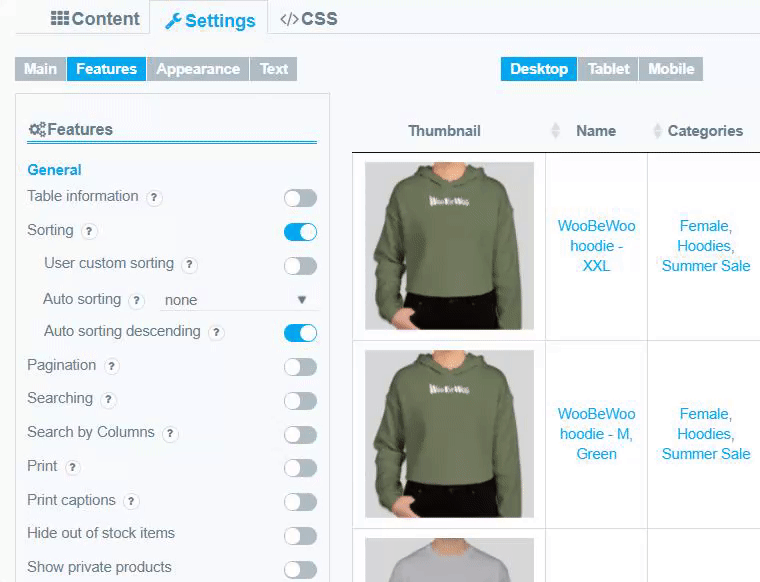
↑ Back to top Sorting. Allow dynamic sorting with arrows. To use this option you must enable Header option.
 Auto-sorting – select the column you want to be sorted by default the page first loads.
Auto-sorting descending. The default is the 1st column and “Ascending” order for the sorting. Enable the checkbox if you want to sort by descending.
Custom sorting. Enable the checkbox if you want to add a sort by drag-n-drop from the admin table preview to the frontend. To set the custom sorting, move to the Content tab, add the products to the table, and drop and drag them in the exact order you need:
Auto-sorting – select the column you want to be sorted by default the page first loads.
Auto-sorting descending. The default is the 1st column and “Ascending” order for the sorting. Enable the checkbox if you want to sort by descending.
Custom sorting. Enable the checkbox if you want to add a sort by drag-n-drop from the admin table preview to the frontend. To set the custom sorting, move to the Content tab, add the products to the table, and drop and drag them in the exact order you need:
 Moreover, you can set the order for the product manually. You can easily replace the item to the necessary position. It is a more convenient way if the table contains a big number of products. Also, this is the only way to move the product to the next or previous page due to pagination.
 The order will be saved in the way you set it and will display in a table.
Pagination. Show table pagination.
The order will be saved in the way you set it and will display in a table.
Pagination. Show table pagination.
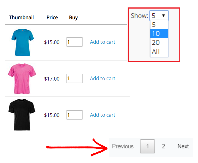 Pagination menu if you’d like to show the drop-down list to select the number of products on the page for display.
If Pagination menu is enabled, in Pagination list content you can set the number of rows to display on one Pagination page. Establish several numbers separated
by a comma to let users choose it personally. The first number will be displayed by default. Since that the number of Pagination Pages will be recounted also.
If Pagination menu is disabled, set the number of products to display on one page in Products per Page option.
Server-side Processing – this option is recommended for large tables that cannot be processed in a conventional way. The table will be sequentially loaded by ajax
on a per-page basis, all filtering, ordering and search clauses is server-side implemented too.
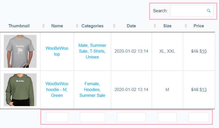
Searching. Enable to add an instant search by keywords.
Search by Columns. Add search by table columns. Use a semicolon as a separator to select any of the values.
Pagination menu if you’d like to show the drop-down list to select the number of products on the page for display.
If Pagination menu is enabled, in Pagination list content you can set the number of rows to display on one Pagination page. Establish several numbers separated
by a comma to let users choose it personally. The first number will be displayed by default. Since that the number of Pagination Pages will be recounted also.
If Pagination menu is disabled, set the number of products to display on one page in Products per Page option.
Server-side Processing – this option is recommended for large tables that cannot be processed in a conventional way. The table will be sequentially loaded by ajax
on a per-page basis, all filtering, ordering and search clauses is server-side implemented too.
Searching. Enable to add an instant search by keywords.
Search by Columns. Add search by table columns. Use a semicolon as a separator to select any of the values.
 Print. Print the product data straight away from the table in one click.
Also, you can save your table as PDF file by choosing to save as pdf at the new window in destination settings.
Print captions. If enabled, you can print the table caption, description and signature.
Hide the out of stock items helps you to hide all of the products that do not available.
Show private products feature needs to display products on the front-end.
Show variation thumbnails – if you have different pictures for a variable product, the thumbnail will be changed that the user selects the variation.
Print. Print the product data straight away from the table in one click.
Also, you can save your table as PDF file by choosing to save as pdf at the new window in destination settings.
Print captions. If enabled, you can print the table caption, description and signature.
Hide the out of stock items helps you to hide all of the products that do not available.
Show private products feature needs to display products on the front-end.
Show variation thumbnails – if you have different pictures for a variable product, the thumbnail will be changed that the user selects the variation.
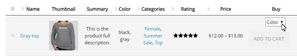 Show the first variation as default – preselection of variation for variable products instead of the name of an attribute.
Show variation price in price column – the price of selected variation will be in the Price column instead of the price range + price of the selected variation in Buy column.
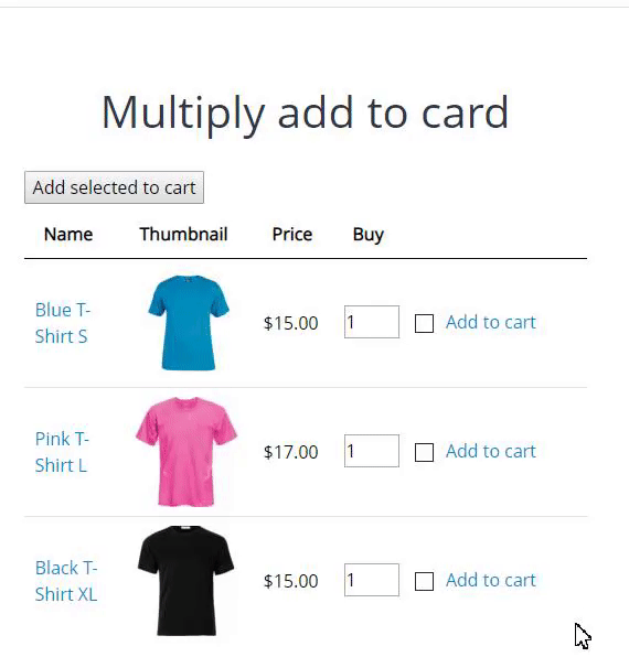
Add all to cart feature allows you to add all current products on the table to the cart.
Add selected to cart allows your customers to select a number of necessary products and add everything to the cart in one go.
Show the first variation as default – preselection of variation for variable products instead of the name of an attribute.
Show variation price in price column – the price of selected variation will be in the Price column instead of the price range + price of the selected variation in Buy column.
Add all to cart feature allows you to add all current products on the table to the cart.
Add selected to cart allows your customers to select a number of necessary products and add everything to the cart in one go.
 Hide view cart link – you can hide a link “view cart” after customer added a product to the cart if you need.
Hide quantity input feature allows you to hide quantity input for add to cart button in the frontend.
Hide view cart link – you can hide a link “view cart” after customer added a product to the cart if you need.
Hide quantity input feature allows you to hide quantity input for add to cart button in the frontend.
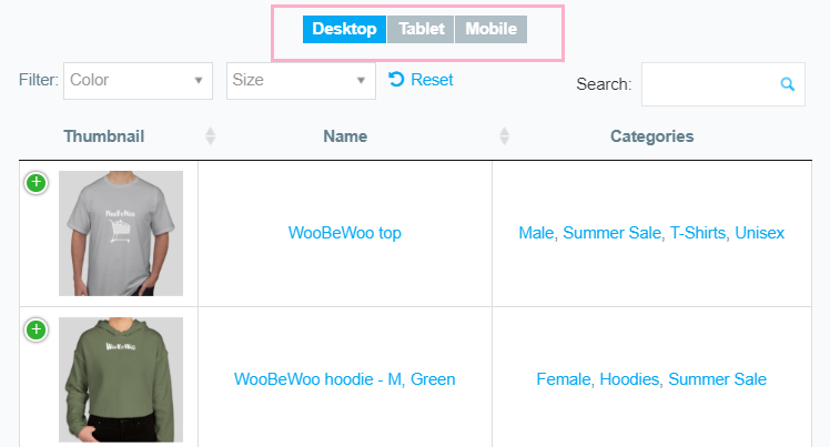
Filters
↑ Back to top- Attribute filter – enable attribute filter and select attributes to filtering.
Attention: you don’t need to add attributes as a column to make filters available. Selected filters will be displayed. If you will add some attribute as a column manually, it will not be hidden even is “Hide searching attributes from a table” is enabled.
Show as multiple drop-down or drop-down with a single select.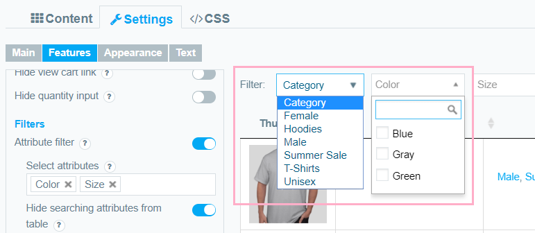 Search for a specific attribute – Results includes all products where the attribute exactly matches the search criteria, f.e:

- Custom taxonomy filter feature allows you to filter by custom taxonomy added with the help of Advanced Custom Fields (ACF) and Custom post UI.
- Category filter allows you to filter by categories of product.
Attention: you don’t need to add the category as a column to make filters available. Selected filters will be displayed. If you will add the category as a column manually, it will not be hidden even is “Hide searching category from a table” is enabled.
Show as multiple drop-down or drop-down with a single select. Category filter position – before or after the attribute filters. Also, WooCommerce Product Table plugin will display the hierarchy of categories in the dropdown list.- Price filter works only with enabled price column.
Product Table appearance
↑ Back to topHere you can choose a visual style of the table.
- Set the fixed table width in PX or %.
- Select the thumbnail size from the list.
- Manage width to hide columns on the mobile screens and set which columns should be hidden on the Content tab in the column options:
- standard
- automatic column hiding
- horizontal scroll
- disabled responsivity
- Borders. Cell – adds a border around all four sides of each cell, Row – adds a border only over and under each row, or select None.
- Row Striping – add an automatic highlight for table odd rows. Useful if you have many rows that are difficult to separate visually. Row striping option will display rows background as two similar shades of colour.
- Highlighting by mouse-hover adds row highlighting on mouseover and make browsing of the table more convenient.
- Highlight Sorted Column – the currently sorted column will be highlighted.
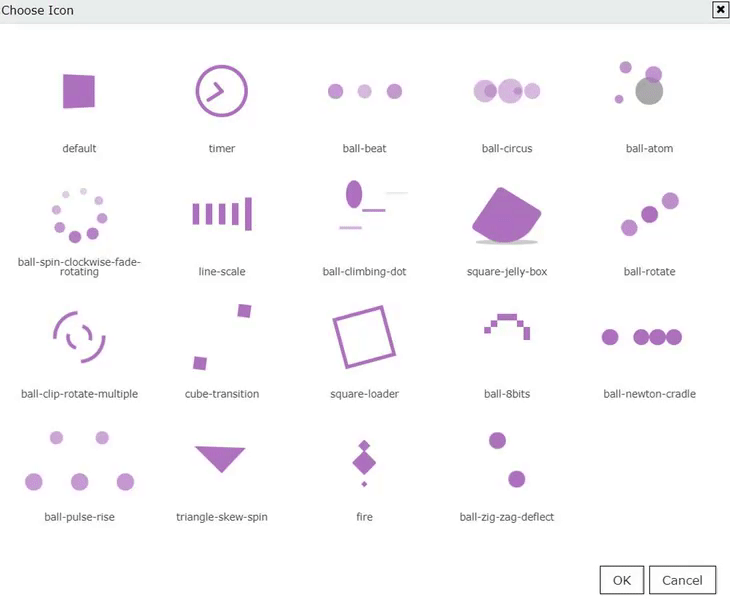
- Enable/disable table loader icon before the table will be completely loaded.
- Choose a table Loader Icon and colour.
Custom table styling
↑ Back to top Borders header. Set the colour and width for a header. These settings apply to a header, footer and “search by columns” field.
 Borders rows
  Borders columns
 Header background. These settings apply to a header, footer and “search by columns” field.
 Header Font. Select the font for a header (the same for a footer), font size and colour:
 Cell background
  Cell font. Select the font for cells, font size and colour:
 Search Bar Colors. Here you are able to set the colour of background, font and border:
 Fixed Layout – set all columns of the same width.
Vertical alignment – set the vertical alignment of table cell contents.
Horizontal alignment – set the horizontal alignment of table cell contents.
Pagination Position – set pagination buttons position, left, centre, right.
Fixed Layout – set all columns of the same width.
Vertical alignment – set the vertical alignment of table cell contents.
Horizontal alignment – set the horizontal alignment of table cell contents.
Pagination Position – set pagination buttons position, left, centre, right.
Buy Button Styling
↑ Back to top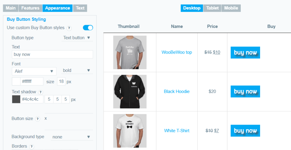
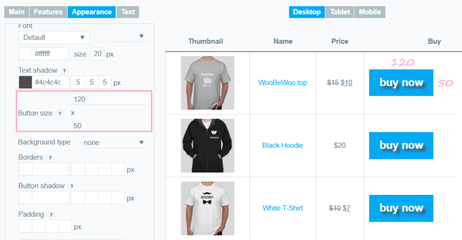
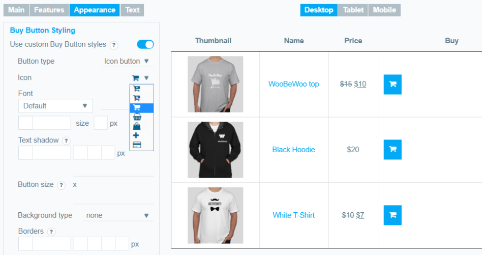 Button size – set width and height values in pixels (in that order).
 Background type – select the type of button you prefer from the list:
- none
- unicolored
- bicoloured
- simple gradient
- pyramid gradient
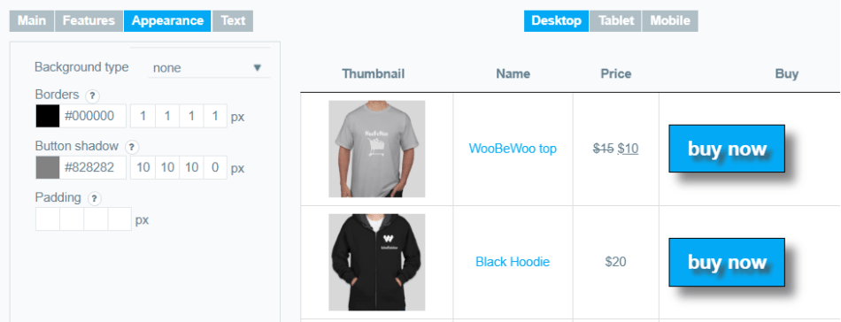
 Borders – set button Borders in this order: colour, top, right, bottom, left.
Button shadow – set button shadow in this order: colour, X, Y, blur, spread.
Padding – set the padding for button content in this order: top, right, bottom, left.
Borders – set button Borders in this order: colour, top, right, bottom, left.
Button shadow – set button shadow in this order: colour, X, Y, blur, spread.
Padding – set the padding for button content in this order: top, right, bottom, left.
Overwrite Product Table Text
↑ Back to top- Multiple add selected to cart button text
- Empty table
- Table info text
- Empty info text
- Filtered info text
- Length text
- Search label
- Zero records
- Filer text
- Reset text
- Stock quantity items text
- Previous page (Pagination)
- Next page (Pagination)
- Select attributes text