Installation
↑ Back to top- Download the .zip file from your WooCommerce account.
- Go to WordPress Admin > Plugins > Add New.
- Click Upload Plugin at the top.
- Choose File and select the .zip file you downloaded in Step 1.
- Click Install Now and Activate the extension.
Getting Started
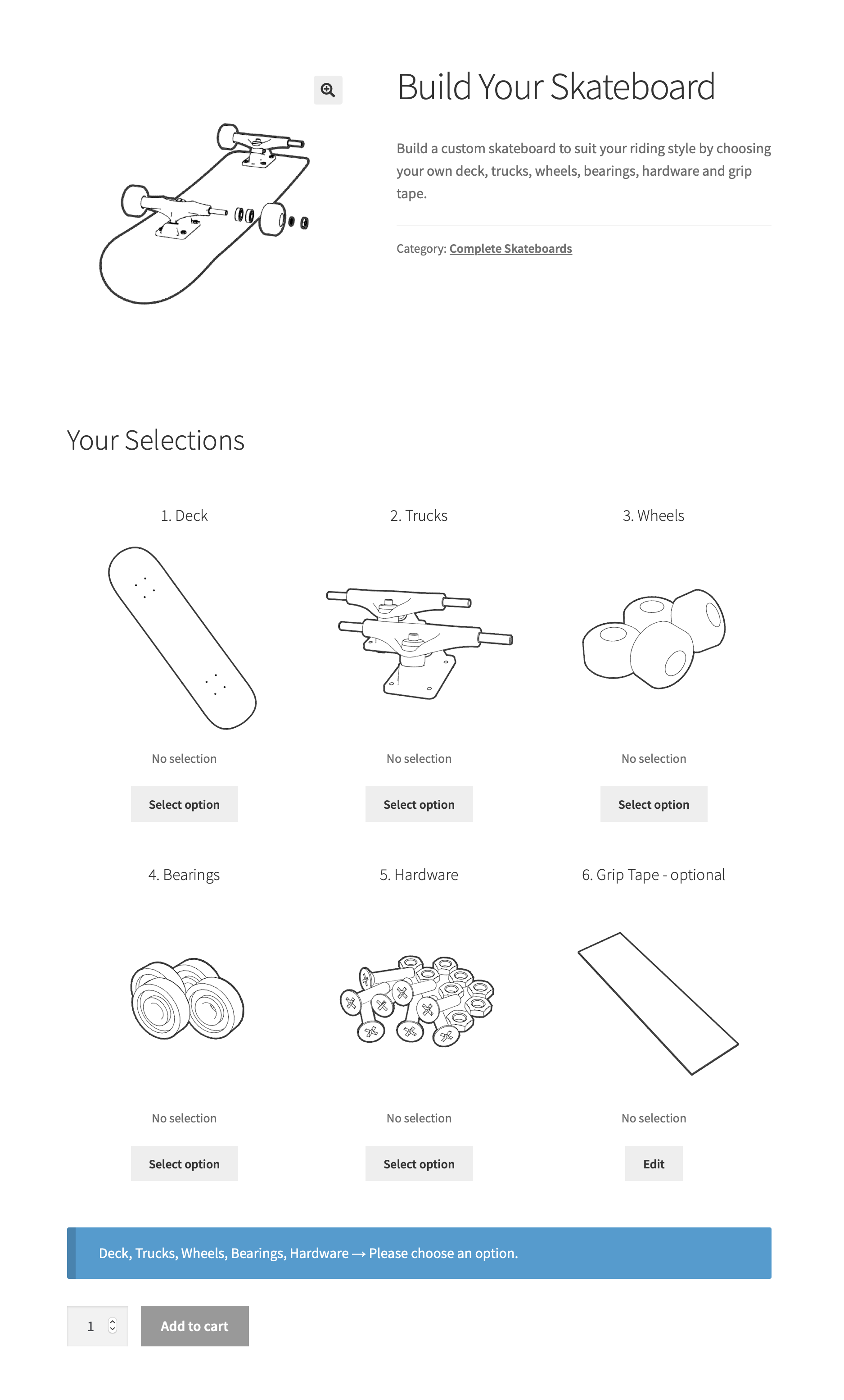
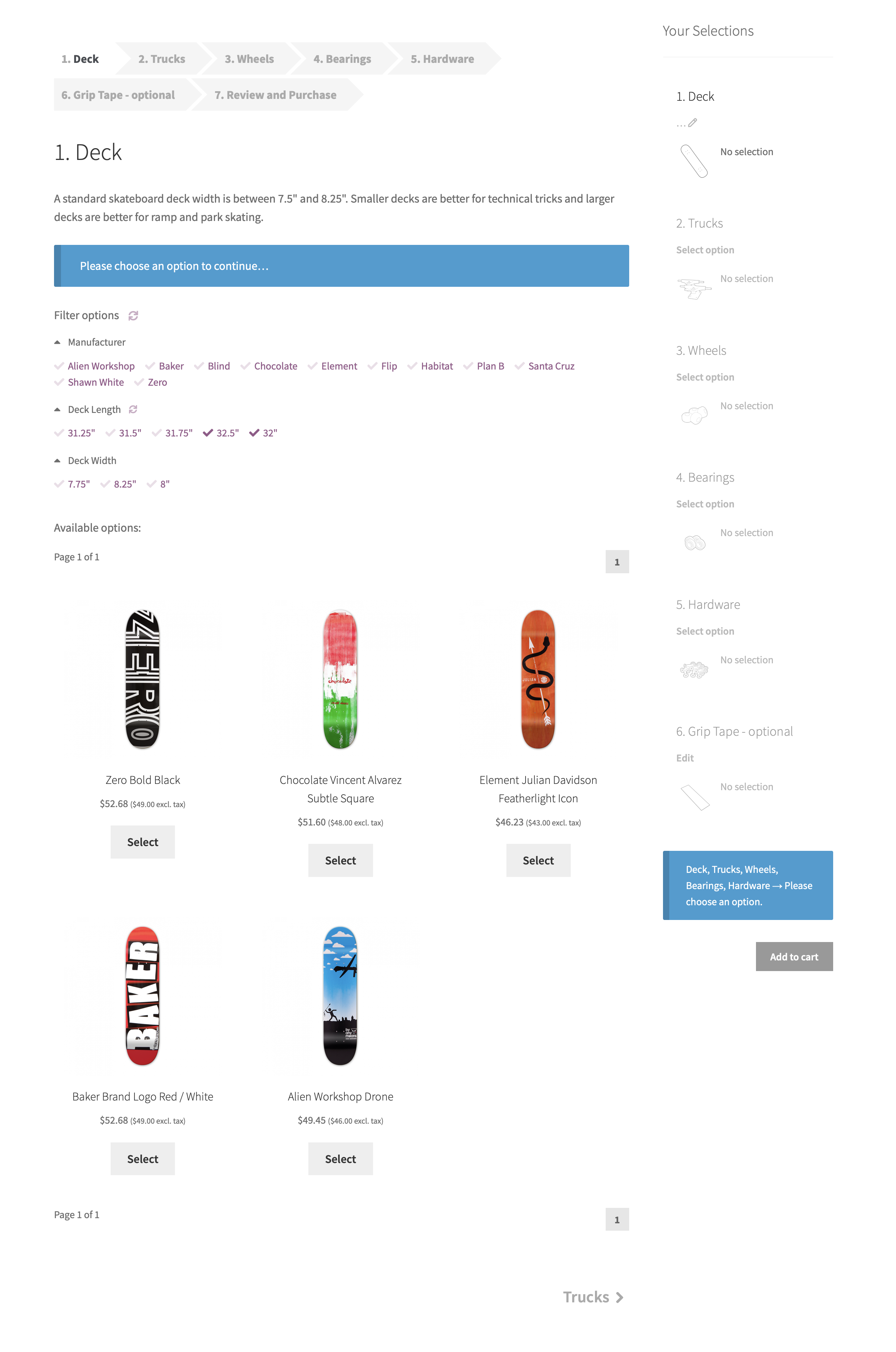
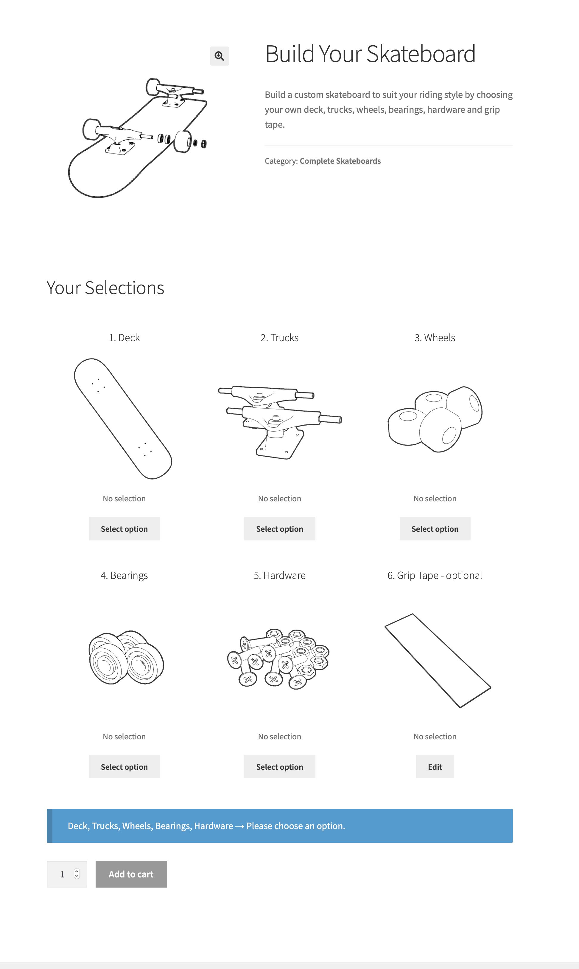
↑ Back to topEvery Composite product consists of multiple building blocks called Components. Each Component offers an assortment of different Component Options to choose from — for example, a custom skateboard is configured by choosing:
- a deck (the actual board of the kit),
- a set of wheels,
- a set of trucks for mounting the wheels on the deck,
- a set of wheel bearings,
- some mounting hardware and
- optionally, some grip tape.
Before creating your first Composite Product, it’s a good idea to:
- Determine the Components that your product/kit is made of.
- Create all products that you would like to offer as Component Options. In the previous example, these would be all the individually stock-managed decks, trucks, wheels, bearings and hardware kits.
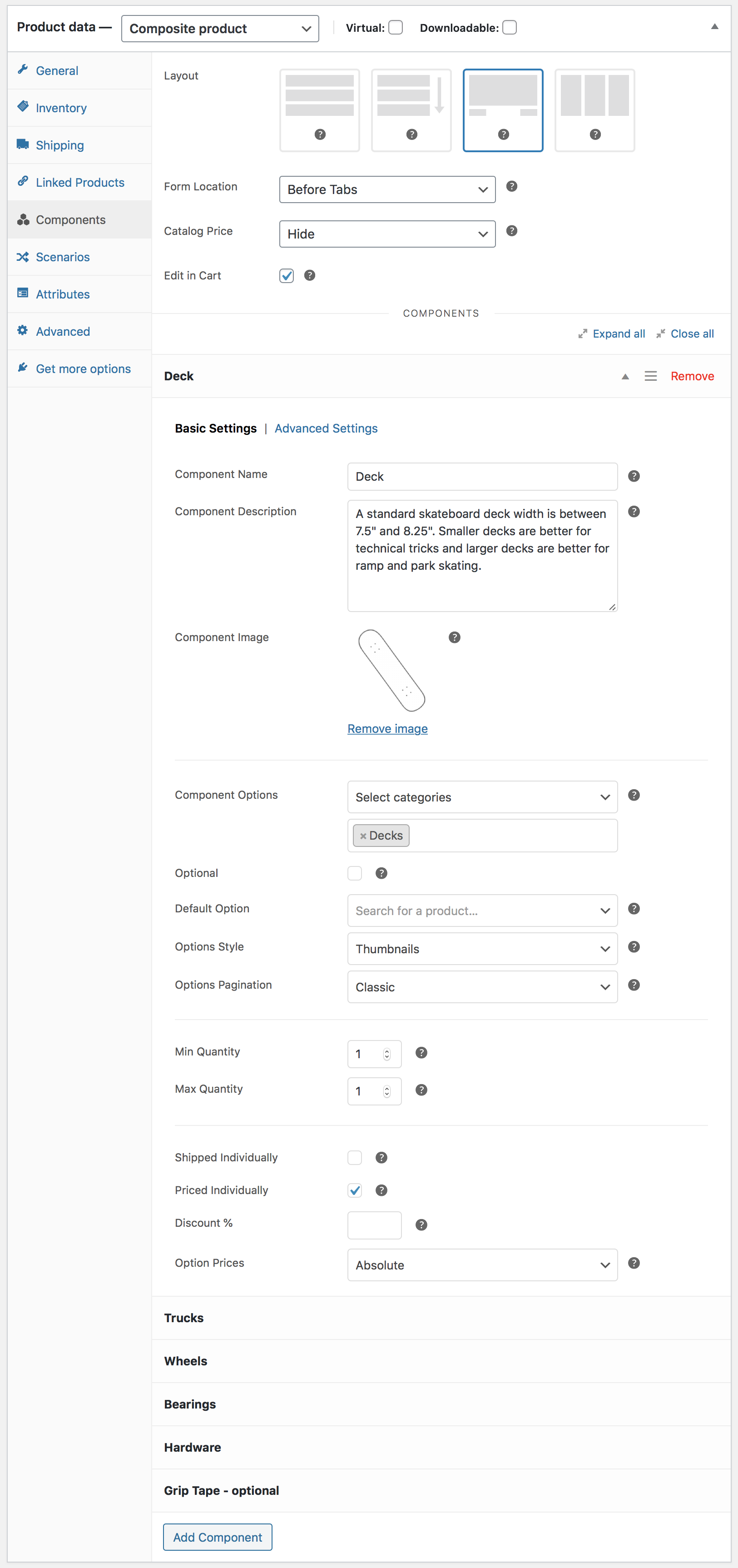
Adding Components
↑ Back to topTo create your first Composite product:
- Go to Products > Add New.
- Select the Composite Product type in the Product Data panel.
- Go to the Components tab.
- Click Add Component to add a Component.
- Give it a Name.
- Add some Component Options. Choose the Select products option to add existing products one by one, or choose the Select categories option to select product categories.
- Repeat these steps to create more Components.
- Publish to save.
Only simple products, variable products and product bundles can be used as Component Options.
Variable products are supported with limitations. For details, check out our FAQ section.
Component settings are organized in two sections: Basic Settings and Advanced Settings. They are documented under Component Settings.
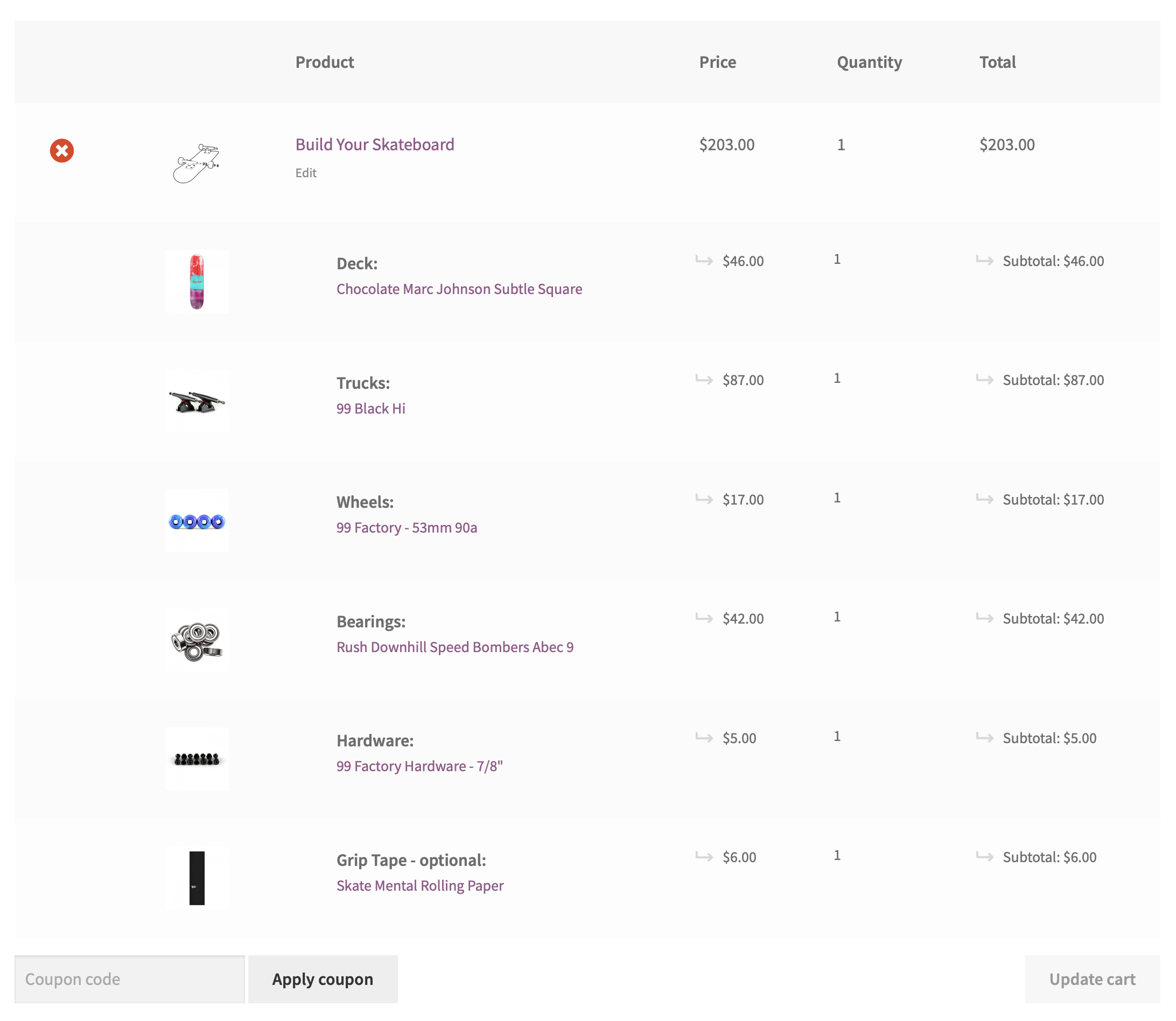
Composite Products in the Cart
↑ Back to topWhen a Composite product is added to the cart, it creates:
- A parent line item.
- Some child line items grouped under it — one for each Component.
This approach makes it possible to define a base price for an entire Composite product, and/or to preserve the prices and tax rates of individual Components when needed.
Hiding Options Conditionally
↑ Back to topThe Composite product type allows you to conditionally hide entire Componenets, or specific products/variations. For details, refer to Store Owner’s Guide – Beyond Basics.
Composite Products vs Product Bundles
↑ Back to topA Component that contains a single, mandatory Component Option is called static. Composite products that consist of static Components are functionally similar to Product Bundles. However, the two product types have some key differences:
- The way Composite products look and behave in various WooCommerce templates is better suited for kitting applications. For instance, a Composite cannot be added to the cart from the shop catalog without viewing its product page.
- The database structure of Product Bundles makes is possible to programmatically retrieve all bundles that contain a product. This is not possible with Composite Products.
- Some advanced features of Product Bundles such as the ability to exclude specific bundled product variations, override bundled product titles/descriptions, and control the visibility of bundled products in different templates are not available in Composite Products.
- The stock status of a Product Bundle is coupled with the availability of its contents. For example, a Bundle that contains 10 T-Shirts will appear as out of stock if there are less than 10 T-Shirts left in stock. In contrast, the stock status of a Composite product is not coupled with the availability of its contents.
To better understand the differences between these two product types, it may help to compare the Complete Skateboard Bundle with the Build-Your-Own Skateboard Composite.
Pricing
↑ Back to topThe Composite product type allows you to:
- set a base price for entire Composite products; and/or to
- preserve the prices of product/variation selections in individual Components.
Setting a Base Price
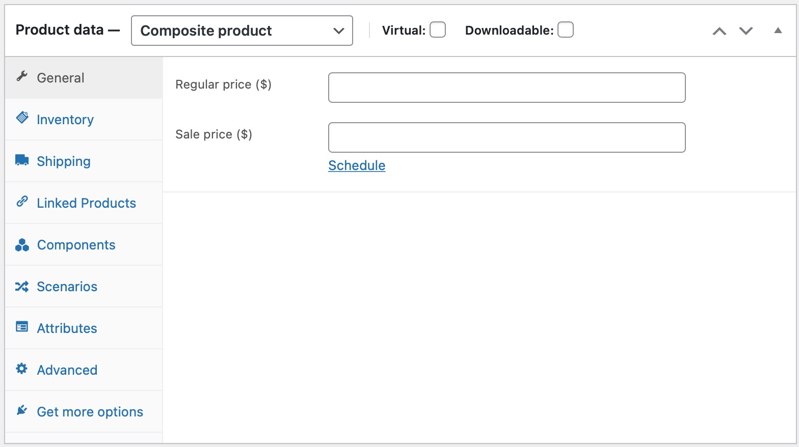
↑ Back to topTo set the base price of a Composite product:
- Go to Products > All Products and select the Composite product you wish to edit.
- Select the General tab in the left menu.
- Enter a Regular Price and, if needed, a Sale Price.
- Update.
If you only set a base price for a Composite product, its configuration will have no effect on its price.
Preserving Component Prices
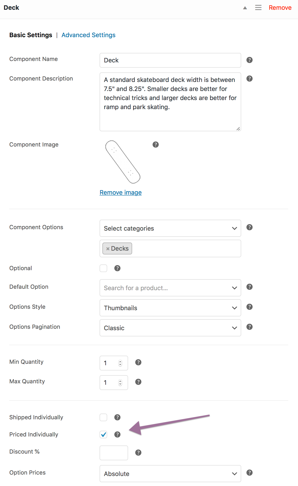
↑ Back to topTo preserve product/variation prices in a Component:
- Locate the Component under Product Data > Components.
- Tick the Priced Individually box in the Basic Settings section.
When Priced Individually is enabled, it is also possible to define a % Discount. Discounts provide an incentive for purchasing items in bulk and/or purchasing optional “add-ons”, such as accessories.
The following example demonstrates how to create a Composite product with 2 Components. Both are Priced Individually and have a 20% Discount. Note that the Composite product does not have a base price, as the Regular Price and Sale Price fields have been left empty.

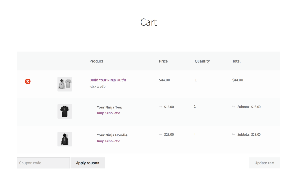
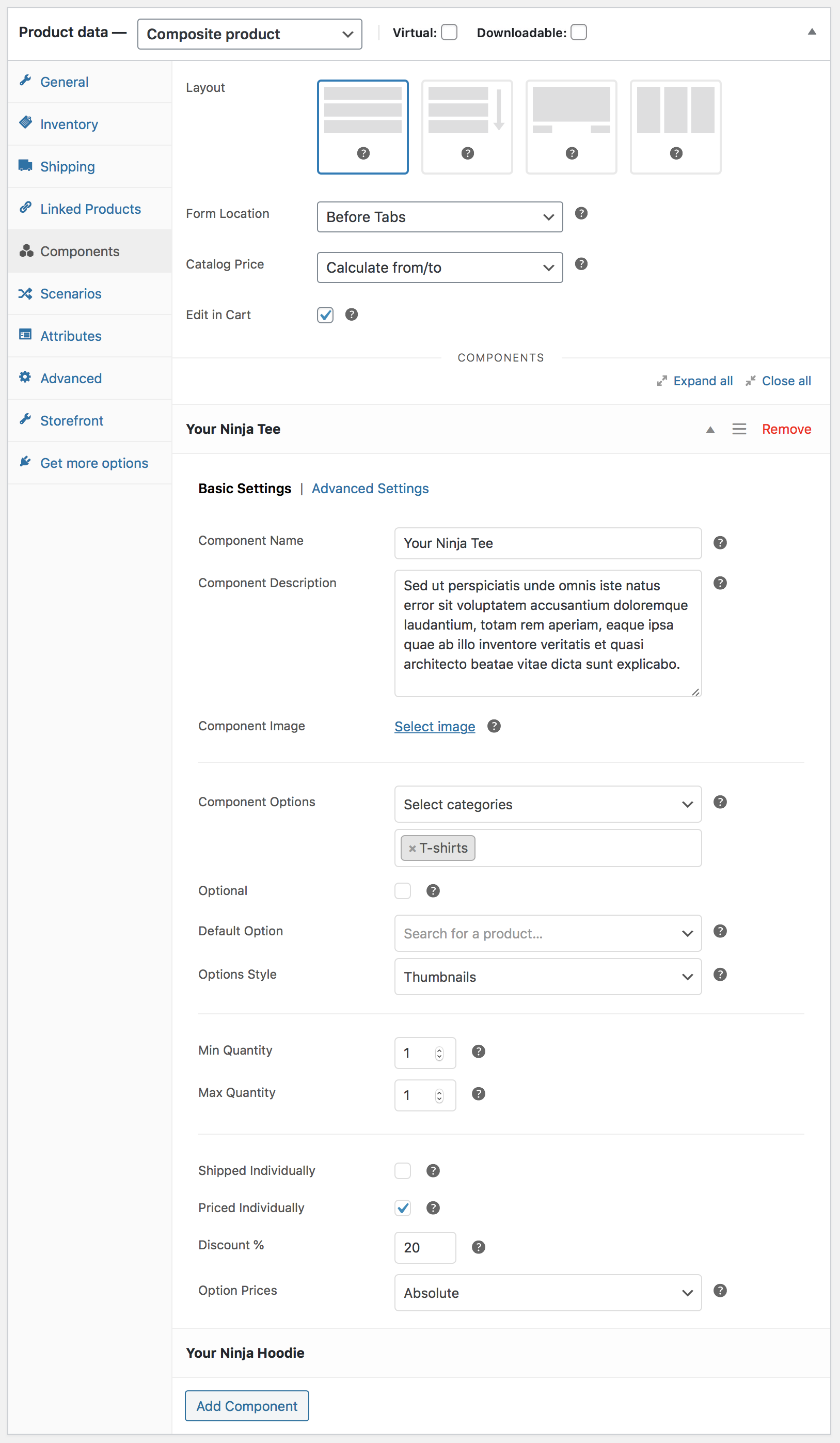
The extension provides many options for customizing the behavior and appearance of your Composite products. In this example, the Ninja Outfit uses the Stacked layout, while Component Options are displayed using the Thumbnails style.
Notes
↑ Back to topComponent Options With Empty Prices
The products/variations offered in a Component must have a price set, even when Priced Individually is unticked. WooCommerce does not allow products with a blank price to be purchased.
Negative Component Prices
The prices of all products contained in individually-priced Components must be positive.
Individual Pricing and Cart/Order Totals
When viewing cart/order details, you may notice that the subtotal displayed next to a Composite parent item includes the subtotals of any individually-priced Components it contains. To preserve the original, unmodified line item subtotals, download and activate this plugin.
Shipping
↑ Back to topIntroduction
↑ Back to topMuch like simple products and product variations, Composite Products can be classified as:
- Physical — composites that need to be physically shipped or picked up.
- Virtual — composites that do not require shipping.
The plugin allows you to add physical products in virtual composites. However, when a virtual composite is purchased, all physical products contained in it will be treated as virtual.
From a shipping point of view, physical Composite Products are classified as assembled or unassembled:
- Assembled kits consist of multiple products that are physically assembled in a common container.
- Unassembled kits group together some products that do not require assembly.
Example: An Assembled Composite
Woo Tech sells desktop computers with WooCommerce. Their pro-grade desktop PC, Woo Pro, is customized online and assembled as ordered. All parts are inventory-managed. Once a Woo Pro PC has been assembled, the original packaging of all assembled components is discarded, and the PC is packaged and shipped in one box along with all product manuals and accompanying material.

Configuration
↑ Back to topTo configure a Composite product for shipping, follow these steps:
- Determine if the Composite you are creating is assembled, unassembled, or partially assembled:
- Assembled Composite products, such as the build-to-order Woo Pro PC we saw earlier, are shipped in a single box. The shipping properties of individual Components are not preserved.
- Unassembled Composite products consist of Components that do not require assembly. Their shipping properties (weight, dimensions) are preserved.
- Partially assembled Composite products have a common physical container. Some Components are assembled in it, and some are shipped in their original boxes.
- Navigate to the Shipping tab in the left menu, and choose a Composite Type. There are two options to choose from: Assembled or Unassembled. If your Composite is a partially assembled one, choose the Assembled option at this point.
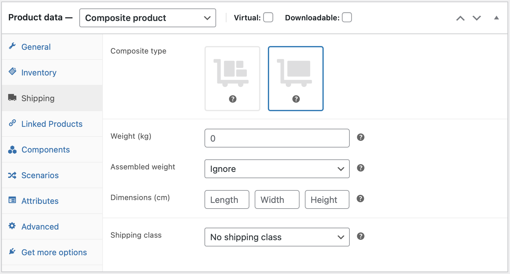
- If you selected the Assembled option in the previous step, go on and configure the Weight, Dimensions and Shipping Class of the common container.
If your assembly has a fixed weight, choose the Assembled Weight > Ignore option. If you prefer to calculate its weight dynamically, choose the Assembled Weight > Preserve option. When Preserve is selected, the Weight field is treated as a container weight, and the weight of the assembly is calculated by adding:
- the specified container Weight; and
- the weight of all assembled Components.
- If your Composite product is partially assembled, go to the Components tab and enable Shipped Individually for every Component that does not require assembly.
Shipped Individually Components are not split across different shipments. The term is used to describe certain Components that are shipped without being physically assembled inside the Composite product they belong to. For example, a Desktop PC may include some assembled parts, but it may also come with an external monitor that is shipped in its own box.
Notes on External Fulfillment Services
WooCommerce gives developers a lot of flexibility to customize the shipping properties of the items contained in the cart: When you add an assembled Composite product to the cart, it is seen by WooCommerce as a single physical item with an aggregated value and weight. Shipping costs are calculated based on this physical representation.
However, this flexibility is not preserved when working with order data. If you are using an external fulfillment, shipping, or inventory management service that reads order data from WooCommerce, please be aware that an assembled Composite product may not be imported as a single item.
Composite Products provides an API that allows developers to modify the physical representation of your Composite products when synchronizing order data with external systems.
Note: We are unable to provide assistance with customizations/integrations under our Support Policy.
Component Settings
↑ Back to topSo far, you have learned how to:
- Assign a title to a Component using the Name field.
- Add product options to a Component using the Component Options field.
- Preserve the price of individual Components by enabling the Priced Individually option.
- Apply a discount on all Component Options using the Discount field.
- Create Assembled and Unassembled Composite products.
In this section, you will learn how to configure the remaining Component settings, located under the Basic Settings and Advanced Settings tabs.
Basic Settings
↑ Back to topComponent Name
See Getting Started.
Component Description
Used to provide details about the Component or its configuration. Supports HTML and shortcodes.
Component Image
Placeholder image displayed in configuration summaries. When a Component Option is chosen, the placeholder image of the Component is replaced by the image of the chosen product or variation. Summary sections are displayed:
- In the final Review step of the Stepped layout.
- In the Configuration Summary of the Componentized layout.
- In the Composite Products Configuration Summary block, which can be added via the Site Editor.
In Layout Options, you will learn more about the available layout options, and understand how to use the Configuration Summary block.
Component Options
See Getting Started.
Optional
Optional Components can be skipped without choosing any product/variation.
Default Option
Allows you to choose a product to use as the default, pre-selected Component Option.
Placeholder Options in Dropdowns
When using the Dropdown style without defining a Default Option, a Choose [Component Name]… placeholder option will appear at the top of the drop-down menu. This placeholder option is omitted when you define a Default Option.
When the Catalog Price > Use defaults option is active, a Default Option must be chosen in all non-optional Components.
Options Style
Controls the appearance of Component Options. You can choose between 3 templates:
- Thumbnails.
- Dropdown.
- Radio Buttons.
| Style | Description |
|---|---|
| Thumbnails | Component Options are displayed as product thumbnails, paginated and arranged in columns similar to the main shop loop.
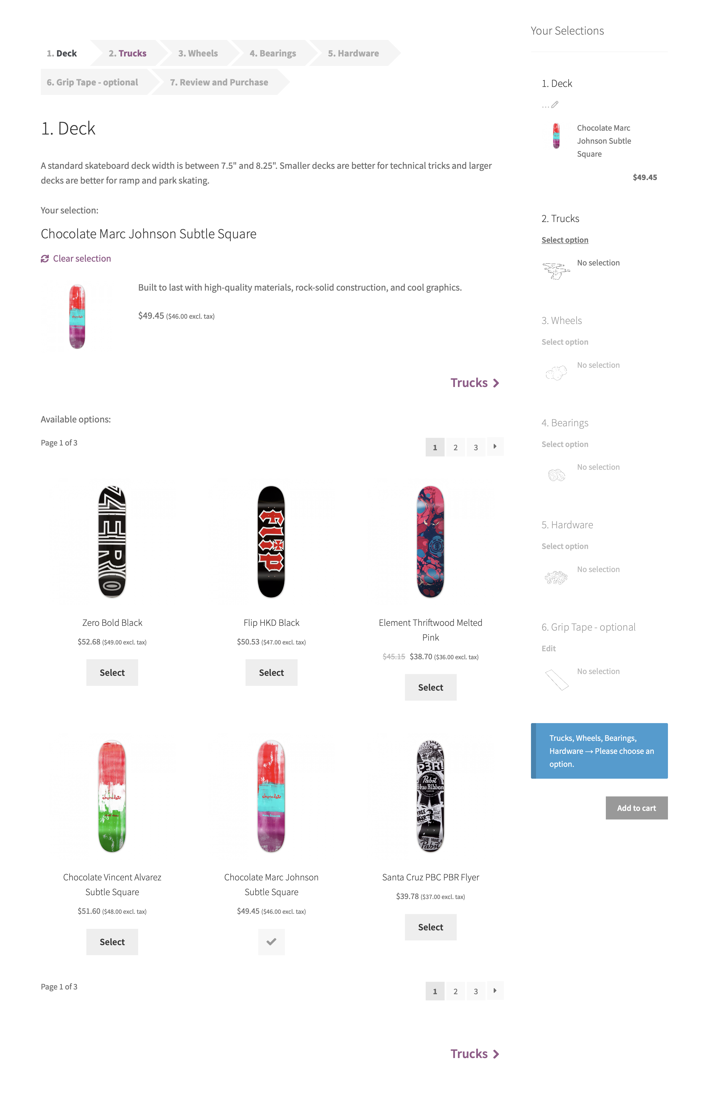 |
| Dropdown | Component Options are listed in a drop-down menu. No pagination or lazy-loading functionality is supported. Suitable for displaying up to 10-15 Component Options.
 |
| Radio Buttons | Component Options are listed as radio buttons. No pagination or lazy-loading functionality is supported. Suitable for displaying up to 6-7 Component Options.
 |
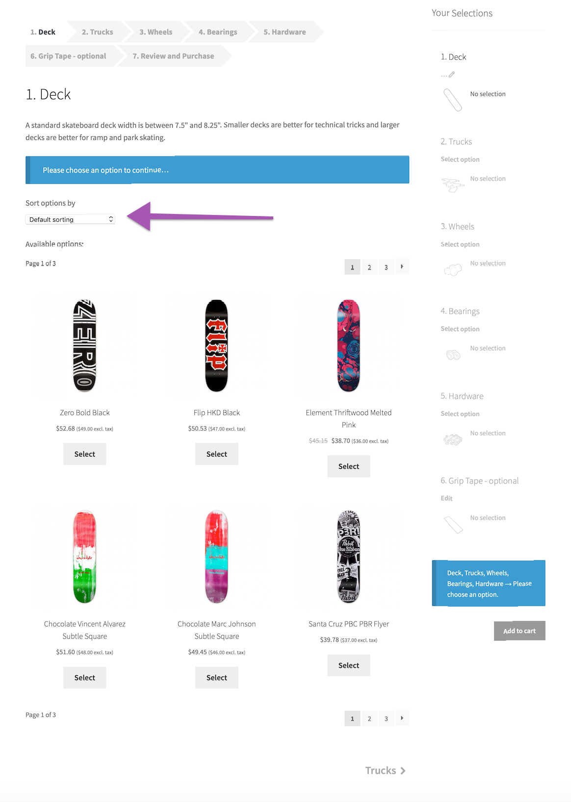
Options Pagination
Changes the way Component Options are paginated:
- Classic — Component Options are arranged in numbered pages, similar to the main shop loop.
- Load more — Additional Component Options can be appended by clicking a Load more button.
Displayed when Options Style > Thumbnails is chosen and the Stepped or Componentized layout is active. If you’re looking for a way to customize the number of columns or number of options that show up per page. Then take a look at our Snippets.
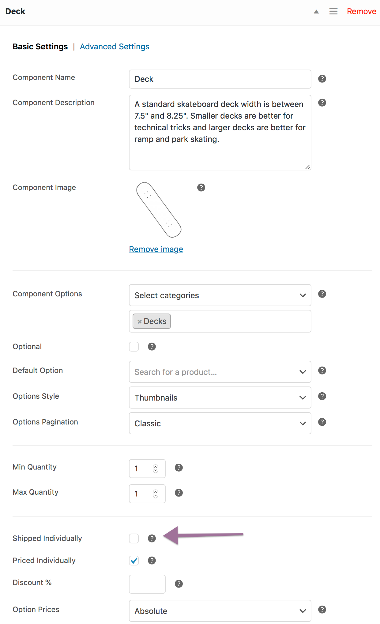
Min/Max Quantity
Controls the minimum and maximum quantity that customers can choose for this Component. Leave the Max Quantity field blank for an unlimited maximum value.
Exception: If a product is Sold Individually, its quantity cannot be higher than 1.
Shipped Individually
Covered in Shipping.
Priced Individually
Covered in Pricing.
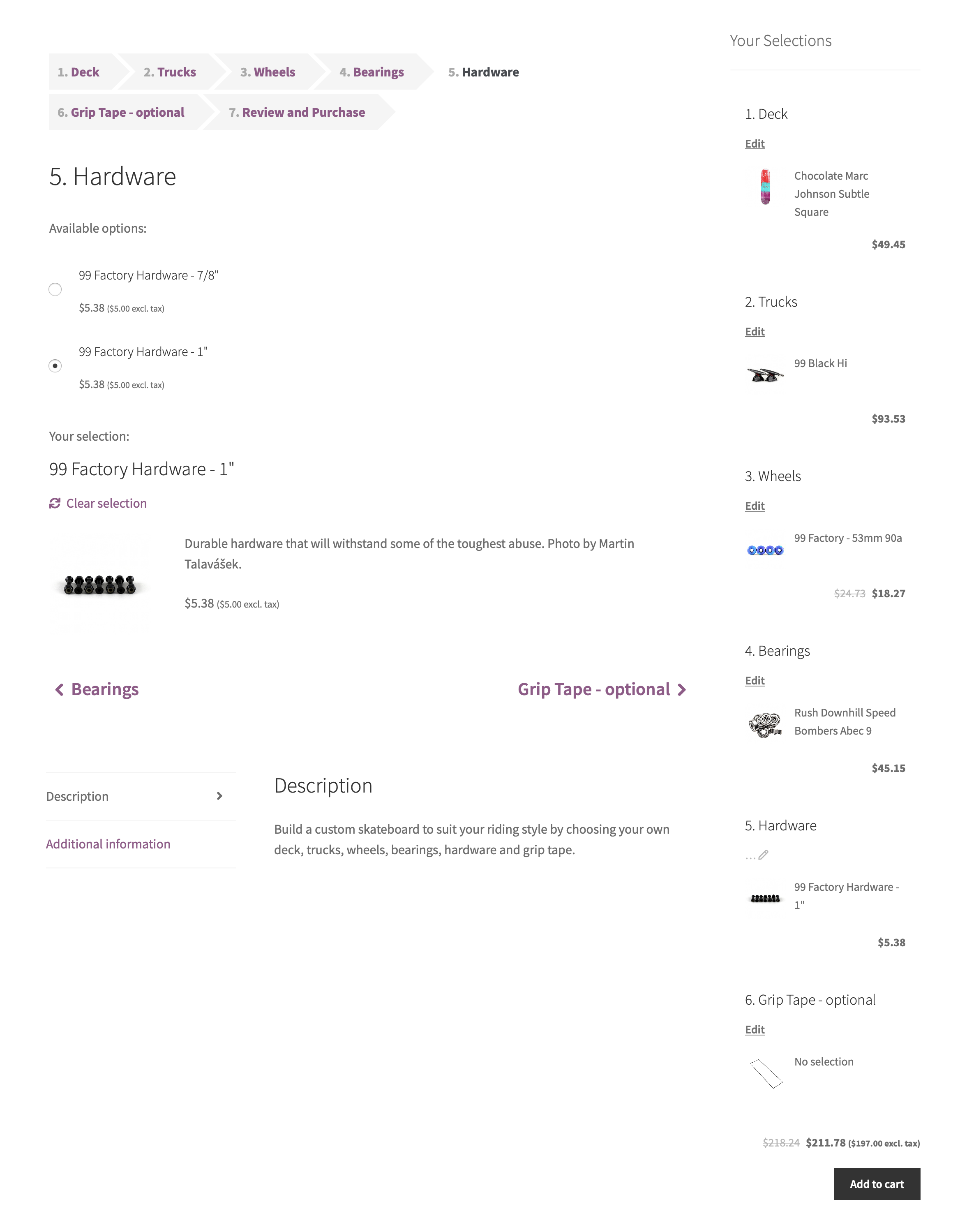
Option Prices
Changes the way Component Option prices are displayed:
- Absolute — Product prices are absolute, e.g. $100.
- Relative — Product prices are calculated and displayed relative to the price of the Default Option, e.g. +$10 or -$20.
- Hidden — Product prices are hidden.
Displayed when Priced Individually is enabled.
Advanced Settings
↑ Back to topOption Select Action
Controls the behavior of the Composite product after a non-configurable Component Option is selected in a Component. Available only with the Stepped and Componentized layouts.
- View selection details — Display the chosen product details without moving to the next Component.
- View next step — View the next Component.
Selection Details Visibility
When customers choose a Component Option, the plugin displays its title, short description, price (when the Priced Individually option is enabled) and possibly additional details, such as variation attributes and/or Product Add-Ons.
These options can be used to individually control the visibility of these elements.
- Title — Controls the visibility of the product title.
- Description — Controls the visibility of the product short description.
- Thumbnail — Controls the visibility of the product thumbnail.
- Price — Controls the visibility of the product price.
- Product Add-Ons – Use this option to disable all Product Add-Ons of the selected product. Applicable when the Product Add-Ons extension is installed.
Subtotal Visibility
Controls the visibility of Component Option subtotals in the single-product page, cart/checkout templates, and order-details/e-mail templates.
Visibility in Payment Gateway Receipts
Hiding component subtotals in the order/e-mail templates may not prevent certain payment gateways from listing them in their transaction receipts, and/or notification e-mails.
Options Sorting
Toggles the display of a “Sort options by” dropdown, which can be used to sort Component Options by popularity, rating, newness or price.
Options Filtering
Toggles the display of layered attribute filters, which can be used to narrow down Component Options based on specific product attributes.
It is only possible to filter Component Options based on global attributes. Composite Products does not support filtering based on custom attributes.
Layout Options
↑ Back to topThe extension covers a wide range of kitting applications that range from small, static bundles to complex product kit builders that may include thousands of Component Options.
Once the contents of a Composite product are defined, the next step is to adjust its layout. The layout of a Composite product can be adjusted by configuring the following options:
- Layout, found at the top of the Components tab.
- Form Location, found at the top of the Components tab.
- Options Style, found under the Basic Settings tab of each Component.
- The Composite Products Configuration Summary block, which can be added via the Site Editor.
Additionally, you can:
- Enable sorting and filtering controls for specific Components.
- Define a default, pre-selected option for each Component.
These options give you a lot of freedom to customize the experience of shoppers who purchase your Composite products. However, in some cases you may not be able to obtain exactly the result you had in mind. If you are looking to change the way a particular element looks or works, the Snippets guide includes a collection of common tweaks. For advanced customization work, we highly recommend Codeable, or a Certified WooExpert.
Layout
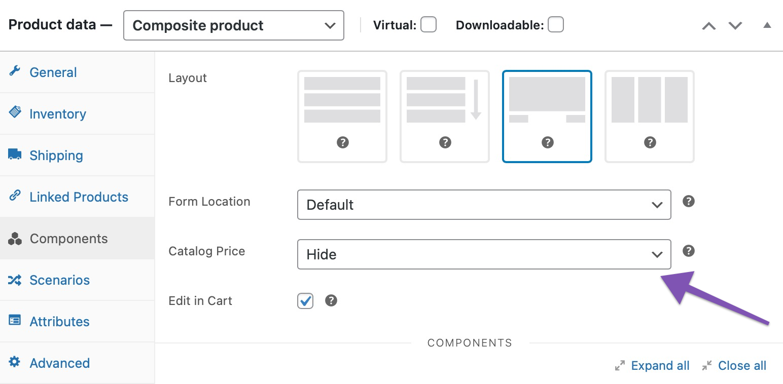
↑ Back to topThe Layout field allows you to modify the way Components are laid out on the screen. Four layout options are provided:
- Stacked
- Progressive
- Stepped
- Componentized
The following table summarizes their differences in detail.
| Layout | Description |
|---|---|
| Stacked | Components are vertically stacked. The add-to-cart button is placed at the bottom.
The Stacked layout is recommended if the Components of your product kit contain a few options, or if you want to keep the configuration process quick and simple. 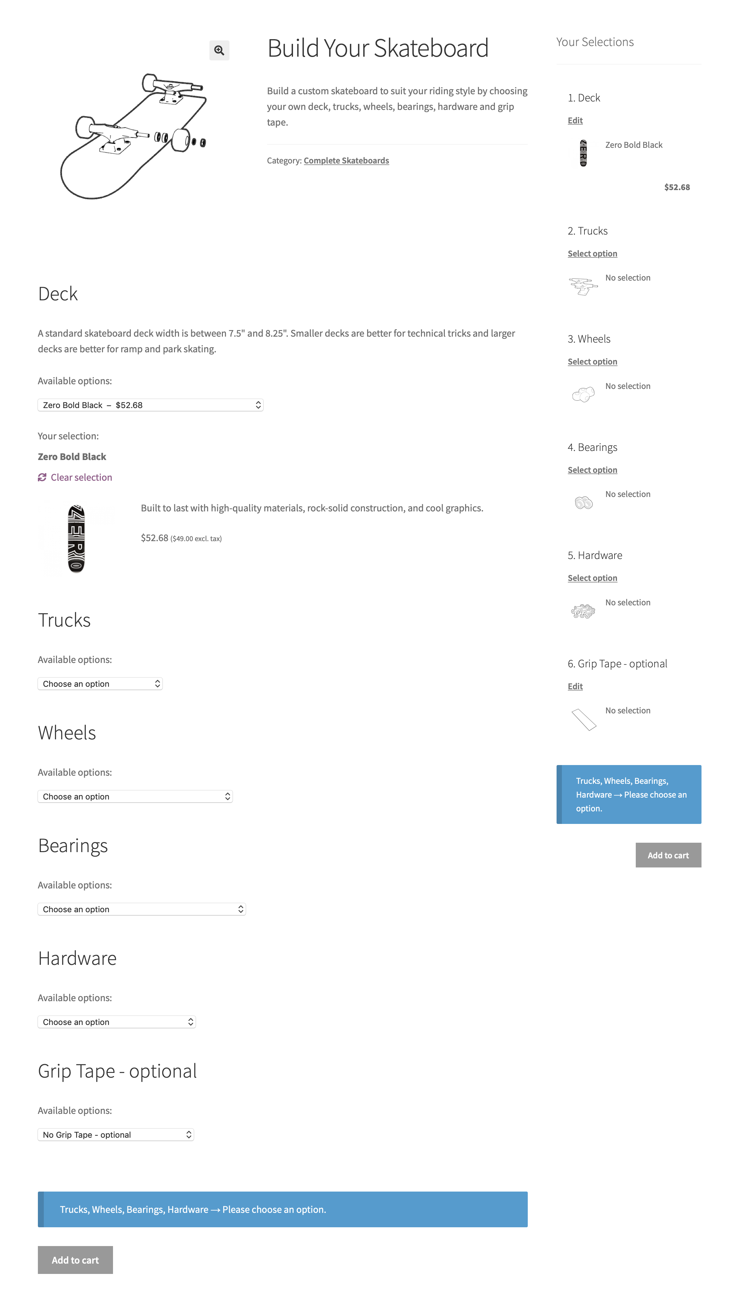 |
| Progressive | Similar to the Stacked layout, with 3 key differences:
Using Toggle-boxes with the Stacked layout
Toggle-boxes can be enabled with the Stacked layout by using this snippet. 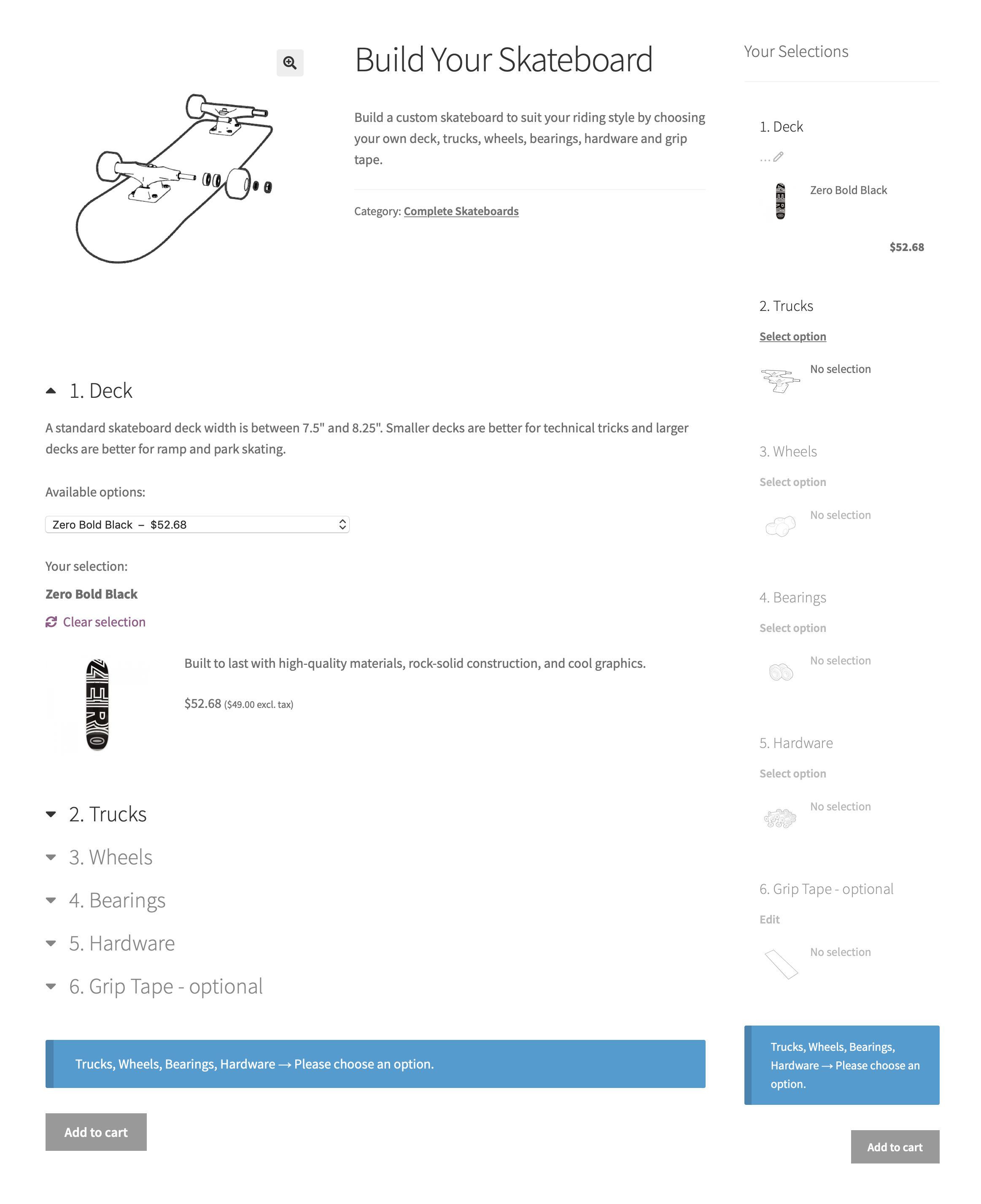 |
| Stepped | Components are presented and configured individually and in sequence, in a step-by-step manner. The chosen options are summarized in a final Review step, at which point the Composite product can be added to the cart.
The Stepped layout is recommended for kitting applications that involve Components with long, complex contents. 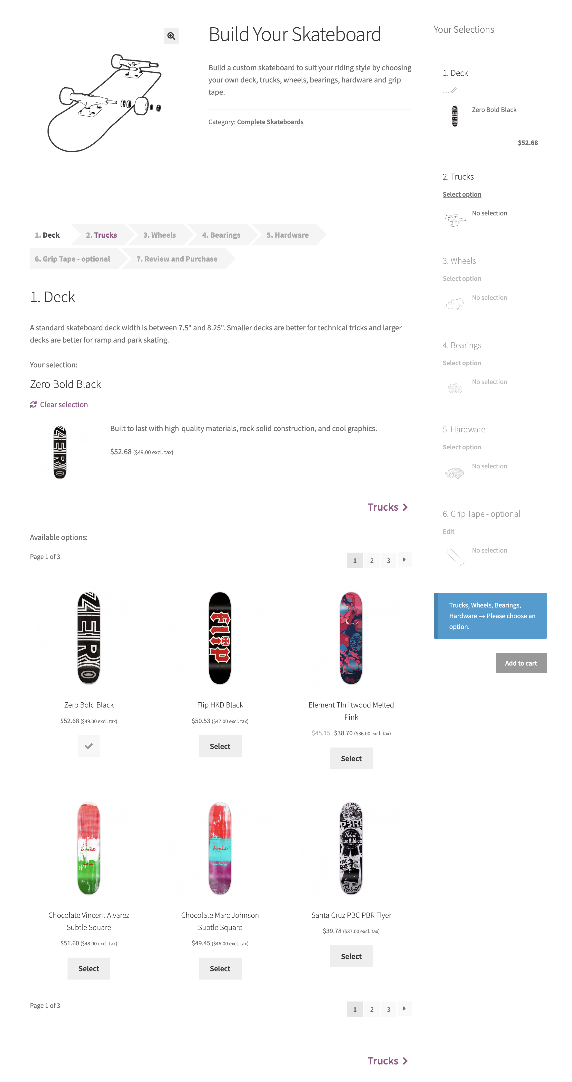 |
| Componentized | Components are presented and configured individually, but not necessarily in sequence. A key element of the Componentized layout is the Summary section, which provides an overview of all Components and lists the chosen options. To configure a Component, the Summary section is temporarily hidden from view. The final configuration can be added to the cart by returning to the Summary.
The Componentized layout is also recommended for kitting applications that involve Components with long, complex contents. By default, the Componentized layout does not require Components to be configured in sequence. This can be changed by activating this snippet.
  |
Rules of Thumb
Configuring a Composite product should be easy and painless – the entire process must keep customers involved and guide them quickly from start to finish. Here are a few rules of thumb for optimizing customer experience:
- Choose the Thumbnails style when you want to display images of the available Component Options, or when offering a large number of options. The Thumbnails style makes Component Options look similar to your WooCommerce shop archives and provides the ability to sort and filter products by attribute – useful for narrowing down results quickly.
- When using the Thumbnails style, consider breaking up the configuration process in individual steps: Experiment with the Progressive, Stepped and Componentized layouts.
- Use the Dropdown or Radio Buttons style wisely: drop-down menus are great space-savers, while radio buttons provide a better overview of the available options.
- The Stacked layout is ideal if you want to make it quick and easy for customers to customize and purchase a Composite product. When using it, keep an eye on page length – long pages are confusing and prone to abandonment.
Form Location
↑ Back to topMost WooCommerce-compatible WordPress themes default to a two-column product page layout: The first column contains the main product image and gallery, while the second one is reserved for product details and options. This space-conserving approach works well for Simple and Variable products, which usually contain only a few form elements.
Composite products tend to have busier forms that require multiple steps/interactions to complete. Sometimes you may find that your theme’s two-column layout makes Composite products look space-constrained and hard to interact with. Some themes may allow you to modify the layout of individual product pages to display product details and options in a single column. For example, if you are using Storefront, the Storefront Powerpack plugin includes options for:
- allocating more width to product form content, or
- stacking product form content below the main product image and gallery.
If you are experiencing layout issues and your theme does not provide any per-product layout options:
- Navigate to Product Data > Components.
- Locate the Form Location option.
- Choose Before Tabs to stack form content before the product tabs.
In most cases, choosing Before Tabs will allocate the entire page width to the form contents of your Composite.
The Before Tabs option is not guaranteed to work reliably with all themes!
A similar result can be achieved with the free WooCommerce Stacked Product Layout plugin.
The Form Location option is not available in block themes.
Configuration Summary Block
↑ Back to topThe Composite Products Configuration Summary Block can be added to the single-product template via the Site Editor (Appearance > Editor > Templates > Single Product). It will be visible only to shoppers who view Composite product pages in your store.
Did you know that you can use the Site Editor to create unique Single Product templates for specific Composite Products? To create custom Single Product template for a specific product:
• From your dashboard, click on Appearance > Editor.
• In the left side panel, click Templates and click the plus sign to add a new template.
• In the options that appear, choose Single Item: Product and search for the product you want to customize.
It provides:
- Dynamically updated configuration details for all Components, including subtotals.
- Navigation functionality – click on a Component in the block and you’ll be taken there.
- Quick access to validation messages and the add-to-cart button.
If you are using a theme that is not compatible with Blocks, then you may use the legacy Configuration Summary Widget instead. This widget can be added to any widgetized area from the Appearance > Widgets menu.
You can customize the appearance and position of the Configuration Summary Block by changing the block’s settings.
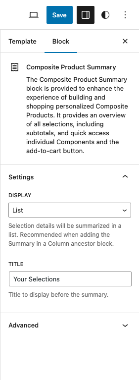
Display > List
When the Display > List option is selected, the Composite configuration details will show up as a list inside the block. You can place the block anywhere in the page by dragging/dropping it to the location you’d like. Moreover, it is possible to change the title that shows up at the top of the block, by configuring the Title option.
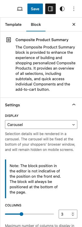
Display > Carousel
When the Display > Carousel option is selected, the Composite configuration details will show up as a slider inside the block. In this case, the block will be fixed at the bottom of the page, regardless of its position in the Site Editor. Moreover, it will remain hidden on mobile screens.
It is possible to change how many component columns will show up in each page of the carousel by configuring the Columns option.
The block can be seen in all examples provided in the Layout Options section.
If you are using a theme that is not compatible with Blocks, then you may use the legacy Configuration Summary Widget instead. This widget can be added to any widgetized area from the Appearance > Widgets menu.
Catalog Price
↑ Back to topThe Catalog Price option changes the way Composite product prices are calculated and displayed in shop archives and single-product page summaries:
- Use defaults — Displays the price of the default Composite product configuration. When this option is selected, a Default Option must be set in all non-optional Components.
- Calculate from/to — Builds a price string based on the configuration with the lowest price.
- Hide — Hides the price.
Avoid using the Calculate from/to option when using Scenarios to conditionally hide Components and Component Options: In this case, the process of finding the lowest price can be a very resource-intensive one.
Cart Editing
↑ Back to topConfigurable Composite products like this Custom Skateboard can be edited from the cart page by enabling the Edit in Cart option.
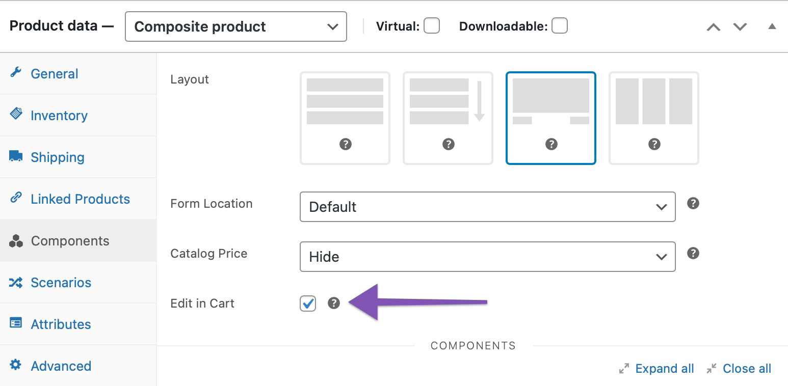
When Edit in Cart is enabled for the Custom Skateboard Composite, an additional “Edit” link is appended to its title in the cart. Following this link allows you to reconfigure the Composite using its current configuration as a starting point. When finished, click Update Cart to replace the configuration in your cart with the new one.
Managing Inventory
↑ Back to topThe sale of a product in a Composite has the same effect on its stock as an individual sale. When configuring a Composite product, if the available stock quantity of a chosen product is below the minimum threshold required by the Component it belongs to, then the Composite appears with an Insufficient Stock status and cannot be purchased.
At the same time, Composite products can have their own SKU, and manage inventory for it. The ability to manage stock at Composite level is useful if a limited resource prevents you from assembling or fulfilling an unlimited number of Composite products within a given period. For example, if you decided to sell personalized skateboards, you would quickly notice that the number of custom skateboards you can ship every day depends on: (i) the time it takes to assemble a skateboard, and (ii) the size of your fulfillment team.
When stock management is enabled at Composite level, the inventory of products used as Component Options is not overridden or affected in any way.
Notes on External Inventory Management Services
External inventory management services utilize proprietary methods to support bundle/kit SKUs. If you are using an external inventory management service that automatically breaks up bundle/kit SKUs into a number of component SKUs, please be aware that some additional integration work might be needed to export Composite product data in a format supported by your service provider.
Composite Products provides an API that allows developers to generate dynamic kit SKUs when exporting order data to external systems.
Note: We are unable to provide assistance with customizations/integrations under our Support Policy.
Viewing Analytics
↑ Back to topComposite Products creates a dedicated Composites section under Woocommerce > Analytics. From here, you can view aggregate revenue data for Composite Products purchased in your store.
Important: This feature requires WooCommerce 4.8+. Note that the WooCommerce Analytics menu item may not be available on some managed WooCommerce hosting environments.
The Analytics > Composites report generates the following metrics for any chosen period:
- Composite Products sold.
- Products Sold in Components.
- Net Sales value.
- Orders containing Composite Products.

Note that the calculated Net Sales figure of the Analytics > Composites report includes revenue originating from:
- the base price of your Composite products; and
- the price of any products sold in Components that were Priced Individually at the time of purchase
To limit results to specific Composite products:
- Click the “Show > All Composite Products” dropdown at the top.
- Select the “Single Composite Product” option.
- Search for and select the Composite product(s) you want to include in the generated report.
In contrast, when you navigate to Woocommerce Analytics > Products and search for a specific Composite product, the reported Net Sales figure includes only revenue originating from (contributed by) its base price.
Use Cases
↑ Back to topThe following use cases are useful for gaining a better understanding of what is possible with Composite Products:
- Creating Configurable Products – A DSLR Camera kit.
- Creating Step-by-step Kit Builders – A Custom Skateboard builder.
- Selling Products in Bulk – The Poster Pack composite.
Questions & Support
↑ Back to topHave a question? Please fill out this pre-sales form.
Already purchased and need assistance? Get in touch with us via the Help Desk!